Preamble
This was a short post that turned into a longer post. The purpose of short post was to highlight and share a new package we have been working on to improve access to Canadian statistical data. This then turned into a post about domestic tourism patterns, and ultimately a discussion about two different types of visualization techniques for comparing changes over time.
Jens and I have been working on an R package to work with Statistics Canada’s public datasets (traditionally referred to as CANSIM tables). I’ll touch more on the purpose of this package shortly, but as the package heads towards completion it needs bug-fixing, tidying, and thoughtful critique ahead of any future CRAN release, and that requires more eyeballs on the code, and more users playing around with the package.
As tourism statistics are what I do in my day-job, I thought it would be neat to showcase this packages abilities with some tourism data. In this case, we will look at some trends in domestic tourism spending and visitation in Canadian Metropolitan Areas from Statistics Canada’s Travel Survey of Residents of Canada dataset.
This post also demonstrates a couple of different approaches for displaying chronological rankings, using a new package for Tuftian slopegraphs by Thomas Leeper to make this
 And to see how it compares to one of my favourite chart-types, the dumbell plot from the ggalt package by Bob Rudis, and when one is more appropriate to use than another one.
The cansim package - some background
Canada’s government statistical agency, Statistics Canada, maintains a public data portal containing tables, profiles, thematic maps, information about public use microfiles, and data visualizations. As of writing this, there’s about 4,900 data tables and this number will likely have grown by the time you read this. This repository was for many years known as CANSIM, the Canadian Socio-economic Information Management System, though nobody ever referred to it by that name, and was used extensively by the public and journalists, academics and dilettantes, and anybody who needed access to Canadian public data.
Statistics Canada recently went through a major redevelopment of this portal to make the data more accessible, more useful, and easier to find, but in the process it broke access to a few existing R packages that could retrieve tables from the old CANSIM. Fresh off working together on the cancensus package for working with Canadian Census data, Jens (let’s be honest, mostly Jens) and I started working on a new package for working with CANSIM data under the same philosophy of encouraging transparency and reproducibility to academic and non-academic use of public data.
There are thousands of these datasets available for researchers, academics, and the general public to access and work with on Statistics Canada’s site and while they are carefully maintained, documented, and catalogued, they do not necessarily lend themselves well to reproducible workflow.
Tables have multiple dimensions and often multiple time periods to draw from and the public interface is designed to encourage users to modify the representation of the table to meet their needs. Between finding the right table, modifying the data in the table, and downloading it, a number of manual steps are introduced that go against the ideals of reproducibility. Working with tables in this way also doesn’t fully take advantage of the abundant metadata associated with each table.
The cansim package is designed to address this. Users can search through the list of tables and identify the ones they need from table metadata. Using a table code they can download the full dataset from a table and they can use the metadata that comes with the table to take advantage of variable hierarchies and value adjustments. One of the biggest advantages of raw CANSIM data is it comes with standardized geographic ID indicators, meaning that it is straightforward to join multiple tables for multiple datasets on common GeoUID values.
The cansim package also fits in nicely with other related packages like cancensus where Census geographies can be matched to CANSIM table geographies using those same common geographic ID indicators, and also to the cmhc package, an under-development package for accessing and working with data from the Canadian Mortgage and Housing Corporation (a federal Crown corporation that produces extensive public data on housing-related matters).
As the package is still under development, and is a little bit aways from a CRAN release, there will still be some bugs. In order to speed it up a little bit, I hope that more people can play around with the development version. Use it, break it (there’s definitely still bugs), let myself or Jens know if the API needs changes or smarter naming conventions, file issues, open pull-requests. It’s all useful as we work to clean it up and eventually submit it to CRAN.
Installing cansim
The package can be installed directly from the Github repo using either remotes::install_github or devtools::install_github.
if (!require("remotes")) {
    install.packages("remotes")
}
remotes::install_github("mountainmath/cansim")
Retrieving and working with CANSIM data
Let’s find the table we are looking for: “Number of census metropolitan area visits, expenditures and nights, by Canadian residents…” from the Travel Survey of Residents of Canada.
library(cansim)
library(dplyr)

# Search for table
search_cansim_tables("census metropolitan area visits")
## # A tibble: 1 x 6
## title table former geo description release_date
## <chr> <chr> <chr> <chr> <chr> <date>
## 1 Number of cens… 24-10-… 426-00… Census… Travel survey of r… 2017-07-25We can get a quick overview by calling get_cansim_table_overview().
get_cansim_table_overview("24-10-0030-01")Looks about right. It’s extremely easy to download the entire table with get_cansim(table_number)
tsrc <- get_cansim("24-10-0030-01")

# Take a look at the data
glimpse(tsrc)
## Observations: 1,617
## Variables: 21
## $ REF_DATE <chr> "2011", "2011", "201...
## $ GEO <chr> "St. John's, Newfoun...
## $ DGUID <chr> "2011S0503001", "201...
## $ `Visit duration` <chr> "All census metropol...
## $ Characteristics <chr> "Number of census me...
## $ UOM <chr> "Number of visits", ...
## $ UOM_ID <chr> "228", "81", "225", ...
## $ SCALAR_FACTOR <chr> "thousands", "thousa...
## $ SCALAR_ID <chr> "3", "3", "3", "3", ...
## $ VECTOR <chr> "v88856249", "v88856...
## $ COORDINATE <chr> "1.1.1", "1.1.2", "1...
## $ VALUE <dbl> 1166, 324276, 1776, ...
## $ STATUS <chr> "B", "B", "B", "B", ...
## $ SYMBOL <chr> NA, NA, NA, NA, NA, ...
## $ TERMINATED <chr> NA, NA, NA, NA, NA, ...
## $ DECIMALS <chr> "0", "0", "0", "0", ...
## $ GeoUID <chr> "001", "001", "001",...
## $ `Classification Code for Visit duration` <chr> NA, NA, NA, NA, NA, ...
## $ `Hierarchy for Visit duration` <chr> "1", "1", "1", "1.2"...
## $ `Classification Code for Characteristics` <chr> NA, NA, NA, NA, NA, ...
## $ `Hierarchy for Characteristics` <chr> "1", "2", "3", "1", ...Full tables downloaded from Statistics Canada have a VALUE field and a SCALAR_FACTOR which can be thousands, millions, dollars, percent, etc. The normalize_cansim_values() function will automatically adjust these tables into something that is easier to work with. In this case, it will convert thousand dollar fields into normal numbers with proper scales.
tsrc <- tsrc %>%
  normalize_cansim_values()
Exploring the data
With the relevant data table downloaded, we can take a look inside to see what data is available for us to work with.
# What characteristics do we have?
unique(tsrc$Characteristics)
## [1] "Number of census metropolitan areas (CMA) visits"
## [2] "Visits expenditures"
## [3] "Nights"There’s three different types of values here: visits, nights, and expenditures. These values are calculated from a very large-sample survey, but the expenditure numbers should still be viewed as estimates.
# Different durations
unique(tsrc$`Visit duration`)
## [1] "All census metropolitan areas (CMA) visits"
## [2] "Same day census metropolitan areas (CMA) visits"
## [3] "Overnight census metropolitan areas (CMA) visits"This data can be further sliced by the type of visit: overnight, same-day, and combined. Tourism researchers are typically more interested in overnight visitation as that is more indicative of travel travel.
# HOw many CMAs are in this data?
unique(tsrc$GEO)
## [1] "St. John's, Newfoundland and Labrador"
## [2] "Halifax, Nova Scotia"
## [3] "Moncton, New Brunswick"
## [4] "Saint John, New Brunswick"
## [5] "Saguenay, Quebec"
## [6] "Québec, Quebec"
## [7] "Sherbrooke, Quebec"
## [8] "Trois-Rivières, Quebec"
## [9] "Montréal, Quebec"
## [10] "Ottawa-Gatineau, Ontario/Quebec"
## [11] "Kingston, Ontario"
## [12] "Peterborough, Ontario"
## [13] "Oshawa, Ontario"
## [14] "Toronto, Ontario"
## [15] "Hamilton, Ontario"
## [16] "St. Catharines-Niagara, Ontario"
## [17] "Kitchener, Ontario"
## [18] "Brantford, Ontario"
## [19] "Guelph, Ontario"
## [20] "London, Ontario"
## [21] "Windsor, Ontario"
## [22] "Barrie, Ontario"
## [23] "Greater Sudbury, Ontario"
## [24] "Thunder Bay, Ontario"
## [25] "Winnipeg, Manitoba"
## [26] "Regina, Saskatchewan"
## [27] "Saskatoon, Saskatchewan"
## [28] "Calgary, Alberta"
## [29] "Edmonton, Alberta"
## [30] "Kelowna, British Columbia"
## [31] "Abbotsford, British Columbia"
## [32] "Vancouver, British Columbia"
## [33] "Victoria, British Columbia"By filtering for number overnight visits only, it’s easy to see which Canadian cities saw the most domestic tourism in 2017.
# In 2017 what were the most visited CMAs in Canada by Canadians?
tsrc %>%
filter(REF_DATE == "2017",
`Visit duration` == "Overnight census metropolitan areas (CMA) visits",
Characteristics == "Number of census metropolitan areas (CMA) visits") -> top_visits
library(ggplot2)
# remotes::iinstall_github("hrbrmstr/hrbrthemes")
library(hrbrthemes) # typographic themes
ggplot(top_visits %>% top_n(10, VALUE), aes(y = VALUE, x = reorder(GEO, VALUE))) +
geom_col(fill = "grey10") +
coord_flip() +
theme_ipsum_rc() +
scale_y_comma() +
labs(title = "Top 10 destinations visited for overnight\nvisits by Canadians in 2017",
x = "", y = "Overnight visits", caption = "@dshkol | Source: Travel Survey of Residents of Canada, Statistics Canada, 24-10-0030-01")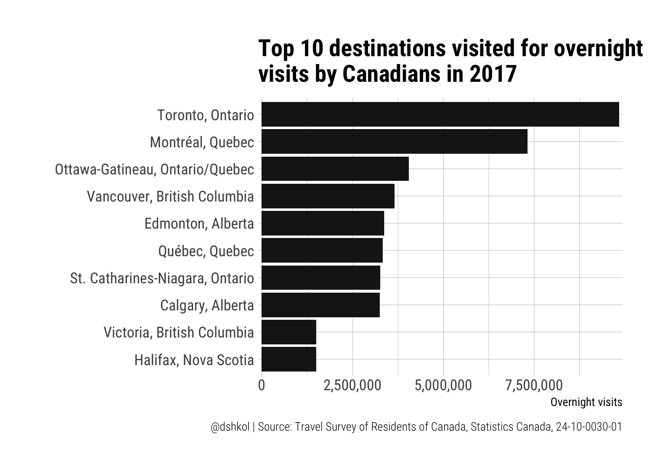 The top two should not be surprising to anyone, but seeing Ottawa-Gatineau ahead of Vancouver is. When it comes to international tourism, the big three of Toronto, Montreal, and Vancouver are far above everyone else, but it is interesting to see the difference when looked at from a domestic travel perspective. I suspect that the additional distance required for most Canadians to make it out the Pacific Coast is a barrier to travel, especially when compared with Ottawa-Gatineau which is around 4 hours away by car from Toronto and under 2 hours away from Montreal. Edmonton, Quebec, Niagara Falls, and Calgary form their own group before a significant drop-off to two similar cities on opposite coasts in Victoria and Halifax.
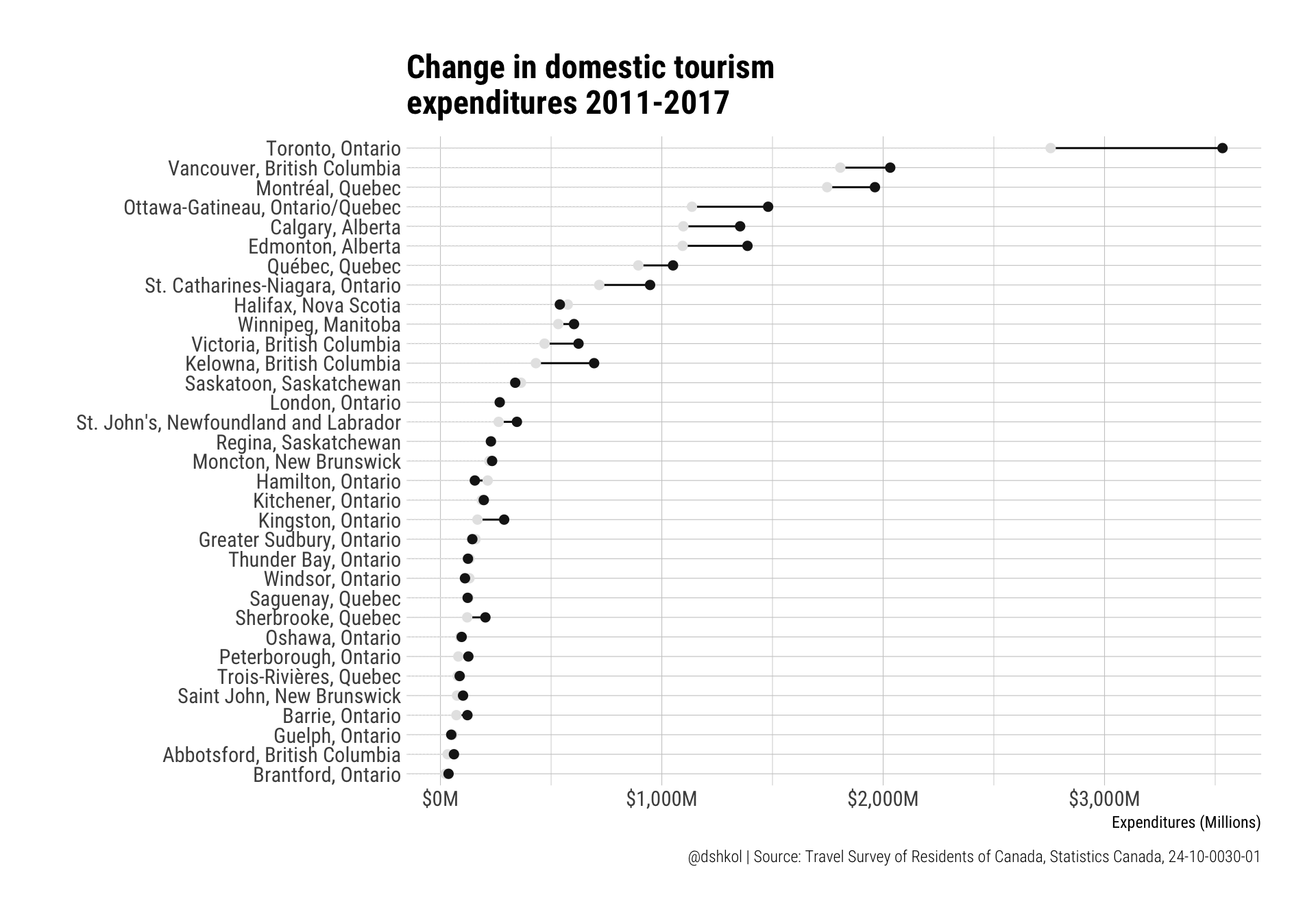
An alternative set of data to look at, instead of visits, is expenditure. In many situations, expenditure data communicates more than visits as a quantifiable metric of tourism industry performance. A destination may receive fewer visitors, but if those visitors are staying longer and spending significantly more then that is usually preferable.
# And top spending?
tsrc %>%
filter(REF_DATE == "2017",
`Visit duration` == "Overnight census metropolitan areas (CMA) visits",
Characteristics == "Visits expenditures") -> top_spend
ggplot(top_spend %>% top_n(10, VALUE), aes(y = VALUE/1000000, x = reorder(GEO, VALUE))) +
geom_col(fill = "grey10") +
coord_flip() +
theme_ipsum_rc() +
scale_y_continuous(labels = scales::dollar_format(suffix = "M")) +
labs(title = "Top 10 destinations visited for spending by\novernight Canadian visitors in 2017",
x = "", y = "Expenditures", caption = "@dshkol | Source: Travel Survey of Residents of Canada, Statistics Canada, 24-10-0030-01")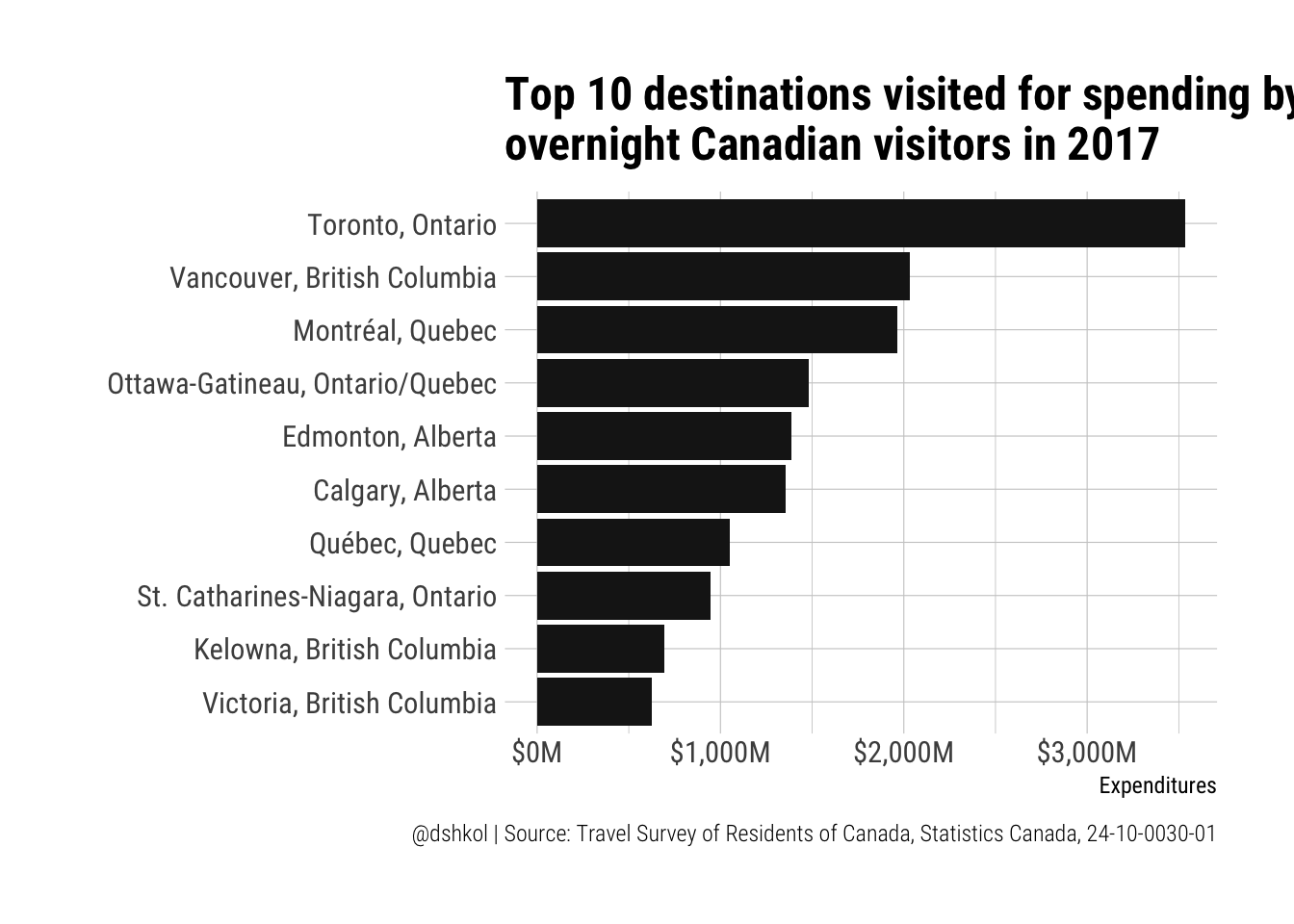 By this measure, Vancouver significantly exceeds Ottawa-Gatineau as a destination for domestic travel to no-ones surprise, and it is interesting to see a similar distribution to what I’m used to seeing with international visitation. I also find it interesting when factoring in spending that Kelowna, British Columbia surges into the top ten domestic destinations. For anyone unfamiliar, Kelowna is a smaller city in British Columbia at the heart of the Okanagan region, which is home to Canada’s most California-like climate in the Summer and is Canada’s premier wine-growing region.
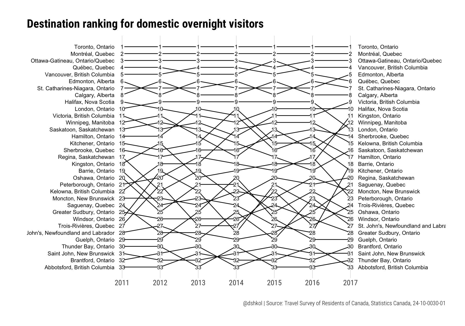
What destinations have grown the most in terms of visitations and expenditures over the last few years? This dataset has visits and expenditure information for 33 CMA regions between 2011 and 2017. That may be too many to effectively visualize with the standard tools in the ggplot toolbox.
Slopegraphs
Slopegraphs are used to communicate and compare changes for a list, especially across one or more time dimensions. They can be used with either absolute values or they can be used with relative values like ranks or indices. Tufte has his critics (c.f. Twitter) and I generally agree with those criticisms, but there’s something to be said for cleanliness and information density in slopegraphs. So it is not surprising to see many examples of slopegraph implementations with R in blogposts or developed packages. One of these packages, Thomas Leeper’s slopegraph package provides a very simple to call version that takes in a wide-shaped data frame (not a tibble) with named rows, and generates a clean slopegraph in either base graphics or ggplot2 graphics. The package is still under development and is not available yet on CRAN, but can be downloaded from Github.
The numbers we are looking at, visits and expenditures, have significant variation in size between the highest and lowest ranking destinations in this dataset. Placing them all on the same scale might lead to something distorted and not pleasing, so my preference for slopegraphs with many elements like we have here is to use ranks instead of absolute values.
# Slopegraphs

# remotes::install_github("leeper/slopegraph")
library(slopegraph)

# Visits
tsrc %>%
  filter(`Visit duration` == "Overnight census metropolitan areas (CMA)  visits",
         Characteristics == "Number of census metropolitan areas (CMA) visits") %>%
  select(REF_DATE, GEO, VALUE) %>%
  group_by(REF_DATE) %>%
  mutate(RANK = dense_rank(desc(VALUE))) %>%
  ungroup() %>%
  select(-VALUE) %>%
  tidyr::spread(REF_DATE, RANK) %>%
  as_data_frame -> visits_wide

geo <- visits_wide$GEO
visits_wide <- visits_wide %>% select(-GEO) %>% as.data.frame()
rownames(visits_wide) <- geo

ggslopegraph(visits_wide, offset.x = 0.06, yrev = TRUE) +
  theme_ipsum_rc() +
  theme(panel.grid.minor.x = element_blank()) +
  labs(title = "Destination ranking for domestic overnight visitors", caption = "@dshkol | Source: Travel Survey of Residents of Canada, Statistics Canada, 24-10-0030-01")
Ranks are fairly consistent in the top-10 and begin to vary below that. I suspect that this is both a result of the top destinations being in a class of their own, but also due to lower sample sizes leading to greater variance for less visited destinations.
Again, we can easily repeat this exercise with spending.
# Spend
tsrc %>%
  filter(`Visit duration` == "Overnight census metropolitan areas (CMA)  visits",
         Characteristics == "Visits expenditures") %>%
  select(REF_DATE, GEO, VALUE) %>%
  group_by(REF_DATE) %>%
  mutate(RANK = dense_rank(desc(VALUE))) %>%
  ungroup() %>%
  select(-VALUE) %>%
  tidyr::spread(REF_DATE, RANK) %>%
  as_data_frame -> spend_wide

geo <- spend_wide$GEO
spend_wide <- spend_wide %>% select(-GEO) %>% as.data.frame()
rownames(spend_wide) <- geo

ggslopegraph(spend_wide, offset.x = 0.06, yrev = TRUE) +
  theme_ipsum_rc() +
  theme(panel.grid.minor.x = element_blank()) +
  labs(title = "Destination ranking for domestic overnight visitor expenditure", caption = "@dshkol | Source: Travel Survey of Residents of Canada, Statistics Canada, 24-10-0030-01")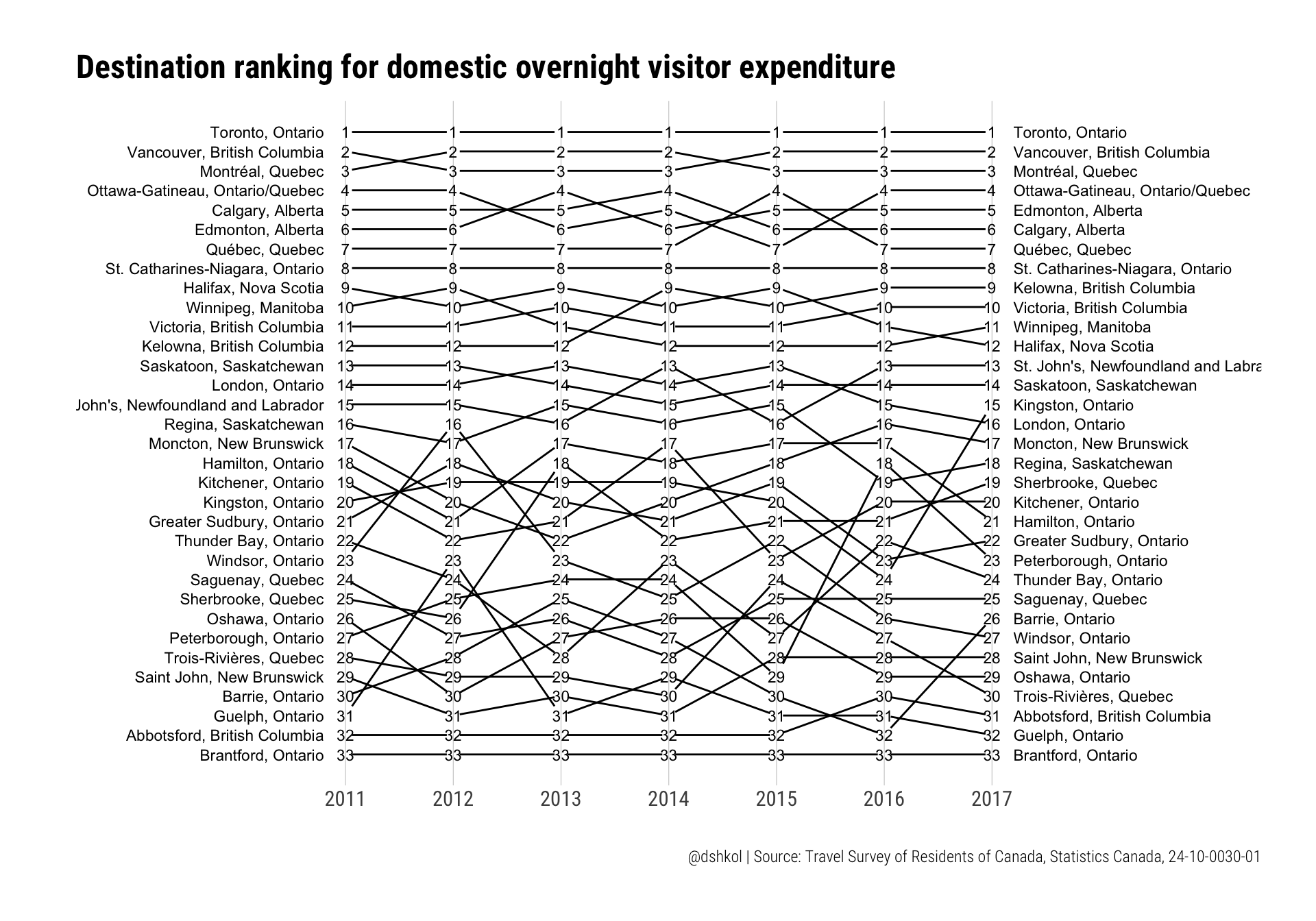
Dumbbell Plots
Dumbbell plots are essentially a combination of a dot plot and a line plot for individual series within data. They are perfect for showing either absolute or relative difference between two data points within the same series. I use them typically for showing comparisons across many series at once, such as the differences at points in time, or differences between categories.
It’s possible to hack together a dumbbell plot in ggplot2 using a combination of geom_point and geom_segment, but the ggalt package by Bob Rudis adds an implementation of this via geom_dumbbell, in addition to a number of other alternative geoms and useful ggplot2 tools.
# install.packages("ggalt")
library(ggalt)
# Visits
tsrc %>%
filter(`Visit duration` == "Overnight census metropolitan areas (CMA) visits",
Characteristics == "Number of census metropolitan areas (CMA) visits") %>%
select(REF_DATE, GEO, VALUE) %>%
tidyr::spread(REF_DATE, VALUE) -> total_visits_wide
ggplot(total_visits_wide, aes(y = reorder(GEO, `2011`), x = `2011`, xend = `2017`)) +
geom_dumbbell(colour_x = "grey90", colour_xend = "grey10",
dot_guide = TRUE, dot_guide_colour = "grey90",
size_x = 2, size_xend = 2) +
scale_x_continuous(labels = scales::comma) +
theme_ipsum_rc() +
labs(title = "Change in overnight visits 2011-2017",x = "Overnight visits", y = "",
caption = "@dshkol | Source: Travel Survey of Residents of Canada, Statistics Canada, 24-10-0030-01")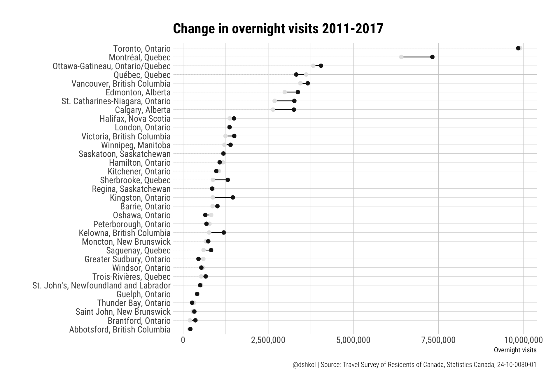 And for tourism expenditures:
Indexed values
If we’re trying to answer the question which destinations have seen the greatest growth between 2011 and 2017, the above visualizations are helpful for communicating absolute changes (i.e. Toronto saw the largest overall increase in expenditures), but not as helpful for communicating relative changes. This also fails to address the relatively low quality of survey data for destinations with fewer visitors.
There are two things we can do here. The first is to use indexed values to show relative changes. The second is to limit this to just the destinations for which we have more reliable data. Fortunately, the CANSIM table we downloaded comes with data quality indicators (“A”, “B”, “C”, …) for returned values based off of their variance.
# Visits
tsrc %>%
filter(`Visit duration` == "Overnight census metropolitan areas (CMA) visits",
Characteristics == "Visits expenditures",
STATUS %in% c("A","B")) %>%
select(REF_DATE, GEO, VALUE) %>%
tidyr::spread(REF_DATE, VALUE) %>%
mutate(INDEX = `2017`/`2011`,
DELTA = ifelse(INDEX >= 1, 1, 0)) %>%
select(GEO, `2017`, INDEX, DELTA) %>%
filter(complete.cases(.))-> spend_index
ggplot(spend_index, aes(y = reorder(GEO, INDEX), x = 0, xend = INDEX-1, colour = factor(DELTA))) +
geom_dumbbell(colour_x = "grey90", colour_xend = "grey10",
dot_guide = TRUE, dot_guide_colour = "grey90",
size_x = 2, size_xend = 2) +
scale_colour_manual(values = c("grey90","grey10"), guide = FALSE) +
scale_x_percent() +
theme_ipsum_rc() +
labs(title = "Percent growth in domestic tourism\nvisitation 2011-2017", x = "", y = "",
caption = "@dshkol | Source: Travel Survey of Residents of Canada, Statistics Canada, 24-10-0030-01")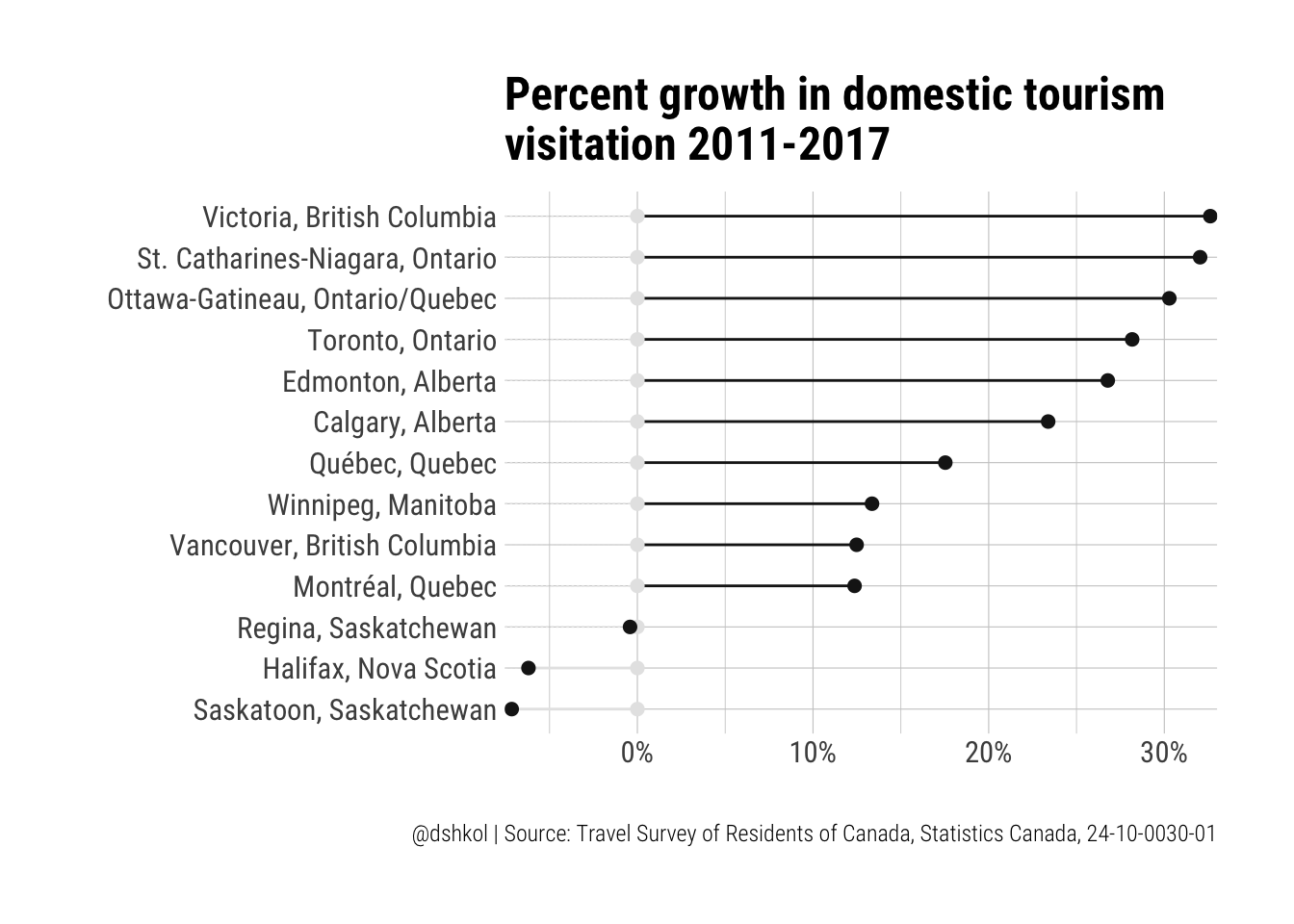 Victoria and the Niagara Falls region really shine, showing over 30% growth in domestic tourism since 2011. These are significant growth numbers. While Niagara Falls is already internationally renowned, the area around in the St. Catherines-Niagara region has come into its own as a cottage and wine touring region in recent years.
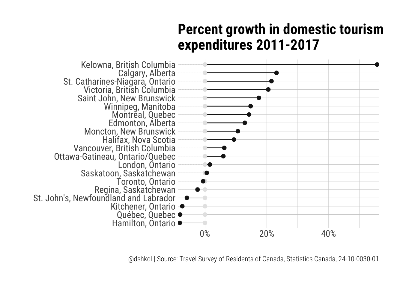 The significant growth in domestic tourism spending in Kelowna becomes really pronounced when removing less reliable, higher variance data. Kelowna and the area around it, Okanagan Lake and regions to the immediate south of it are some of my favourite places in Canada, and while there has been a growing international contingent of tourists, the majority of tourists to this area are still domestic.
Conclusions
Slopegraphs and dumbbell plots can be used to highlight different aspects of data that has multiple series that change over time. Dumbbell plots are typically limited to comparing two values, usually a starting point and an ending point, but they are very effective for showing relative or absolute difference in a quickly digestible manner.
My opinion is that slopegraphs are less effective for communicating absolute or relative differences than dumbbells, but are better for showing ordinal values, such as rankings. This is especially true if you want a visually concise way to show changes in ranks across dimensions such as time. For this, slopegraphs are an excellent option, but there are other alternatives such as parallel coordinates charts and bump charts that can do something similar, if not as visually cleanly.
Finally, just to reiterate, check out the cansim package and share your feedback if this is the kind of package you could see yourself benefiting from or using. Any feedback is appreciated.