This is the first post from what I hope to be is a series of posts looking at the spatial distribution of different demographic variables in Canadian cities. In this post, I take a look at the diversity of visible minority groups in Canadian cities using Census data. By using a measure that relates diversity to segregation, we can also look at how these cities distribute minority groups and to what extent these cities are segregated.
Key points:
- We can use ideas from information theory to come up with a robust measure that relates diversity and segregation.
- Many Canadian cities are quite diverse in terms of distribution of visible minority groups, but the most diverse places are cities in the Greater Toronto Area and the Lower Mainland.
- Some of the most diverse places are also relatively more segregated than other places in Canada
- Overall segregation by visible minority in Canadian cities appears to be relatively low in comparison with cities in other countries but it is difficult to compare directly.
The diversity of Canada’s metropolitan areas
Canada is a pretty diverse nation. There’s a good chance that the notion of the “cultural mosaic” will appear on a new Canadian’s Citizenship test. The diversity of Canadian cities is obvious to anyone who has spent any time in some of Canada’s largest metropolitan areas. Census data includes a number of different dimensions that can be used to quantify diversity. Using Census data, we can measure diversity by looking at broad visible minority groups, specific ethnicity, language, recent immigration origin, among others. There are good reasons to use or not use any of these categories, but this post will focus primarily on diversity as measured by the Census dimension for “Visible minority in private households”. This Census dimension is from the long-form Census questionnaire with about 25% sample coverage and provides variables for the following groups:
- Not a visible minority
- South Asian
- Chinese
- Black
- Filipino
- Latin American
- Arab
- Southeast Asian
- West Asian
- Korean
- Japanese
- Other, and
- Multiple visible minorities
We can also take diversity to represent a variety of groups across any dimension - whether it is based on ethnicity, or wealth, or education, or occupation, or just about any of the multigroup measures available in the Census.
Measuring Diversity to Measure Segregation
There exist a number of different ways to measure the diversity. A typical approach is, for any given geographic area, to construct an index based off the demographic profile of that area. These indices can represent different ways to calculate measures relating to concentration, dispersion, and evenness of demographic variables by groups.
Theil’s Entropy Index
The specific approach used here to measure diversity relies on ideas from information theory. Theil’s Entropy Index (Theil’s E) is a measure of diversity. This approach is well documented and the implementation in this post is based off of Iceland (2004) (pdf from census.gov).
There are two parts to calculating the entropy score. The score first has to be calculated for the entire geographic area:
where \(\Pi_r\) is a given group’s proportion of the entire population of the geographic area. Then an entropy score must be calculated for each sub-region (i.e. Census tract or similar) that is a component of the aggregated region:
where, similarly, \(\pi_{ri}\) is a group’s proportion of the total in sub-region \(i\).
The actual diversity score (Theil’s \(E\)) depends on the number of different groups. If you have 13 possible groups the maximum diversity score is log(13) = 2.5649494. If instead, you used every possible ethnic group in the Census as the basis for your calculation, the max score would be log(244) = 5.4971682. Because of this, Theil’s entropy scores should not be used to compare across different dimensions; rather they are most valuable as a relative measure: a higher number indicates greater diversity. The max score would result if every individual group made up an equal proportion of a geographic area (i.e. if you had 13 groups, you would see that each group represented 1/13 of the total population in that area.)
This measure of entropy on its own can inform us about the diversity in an area but it does not tell us much about segregation because it does not look at the spatial distribution of groups. A place can be highly diverse but also segregated. Two metropolitan areas with the same diversity measured by subgroup proportions can look very different. A metropolitan area where every member of a subgroup is randomly distributed would not score highly on any measure of segregation compared to a metro area where every member of a subgroup lived in their own neighbourhoods.
Measuring segregation requires some knowledge of the distribution of these demographic groups within a region. By taking advantage of different levels of geographic aggregation we can build up an estimate of segregation by comparing the overall diversity of a region at one level of geographic aggregation (e.g. a Census sub-division) and to evaluate how that differs from the diversity observed in the geographic regions that make up that particular region (e.g. Census tracts or Dissemination Areas).
Segregation (Theil’s \(H\)) is measured by a population-weighted sum of the divergences between the diversity index at the aggregate level and the same indices at the sub-regional level.
With this measure, a higher \(H\) indicates greater levels of segregation.
Data and tools
All data in this post comes from Statistics Canada’s 2016 Census, accessed and retrieved through our cancensus R package. I am biased but I think this package is the best way to work with Canadian census data and allows for a more programmatic way to retrieve and manipulate Census data. The maps in this post combine Census data with vector tile data from Nextzen, an open-source project that has kept Mapzen’s (RIP) great open-source geographic tools online. I discuss the code and the tools used in a little bit more detail at the end of the post, and the code used to generate the analysis and visuals in this post is view-able on Github.
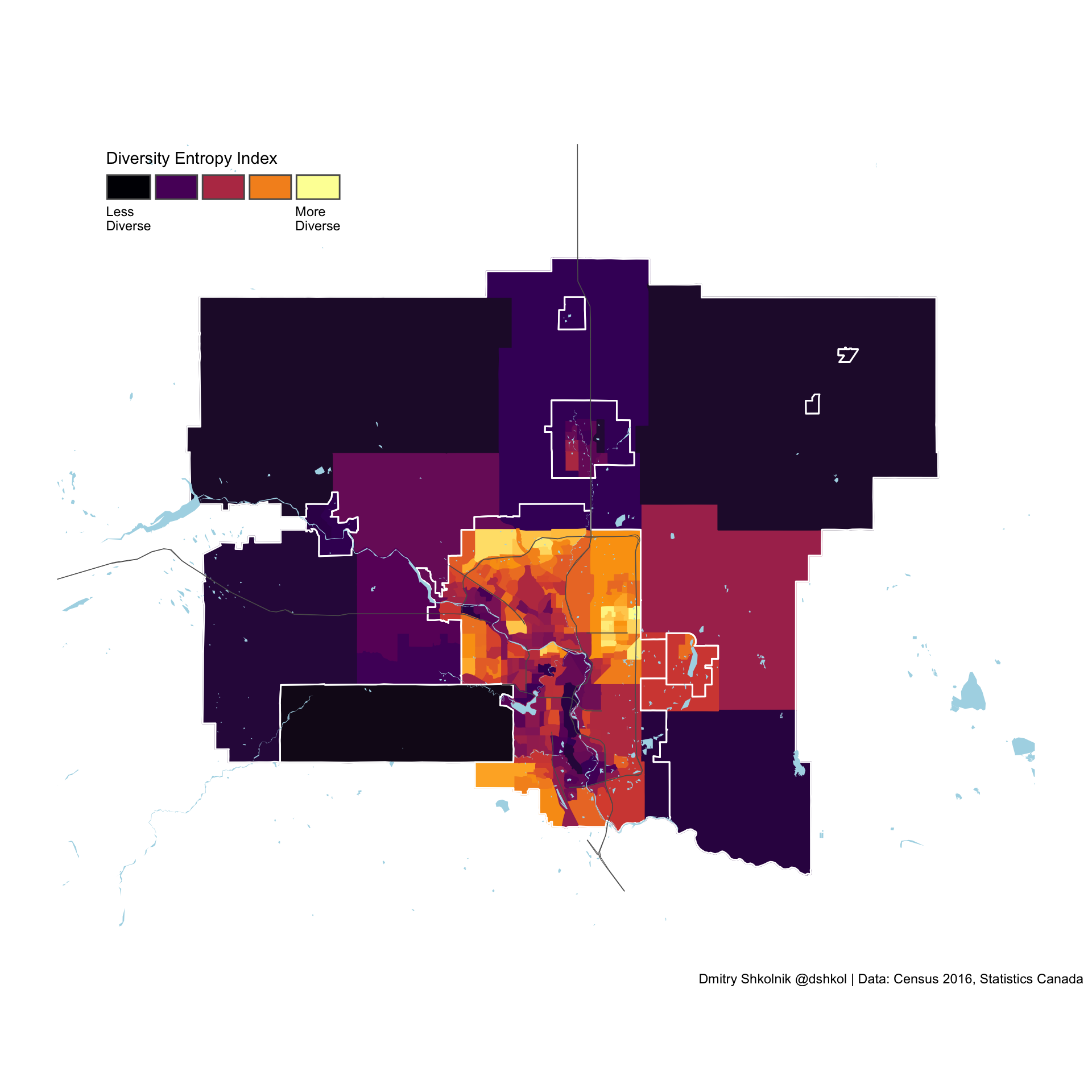
What diversity looks like in the Vancouver CMA
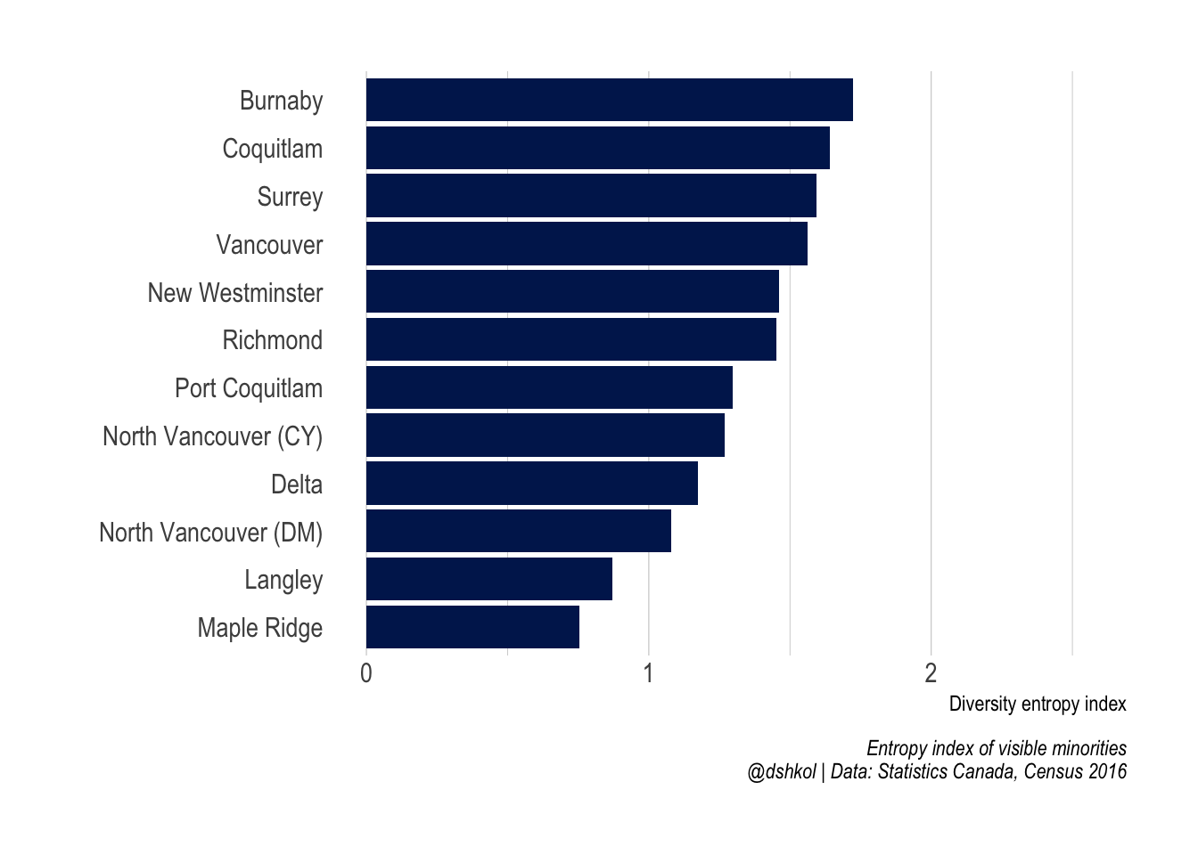
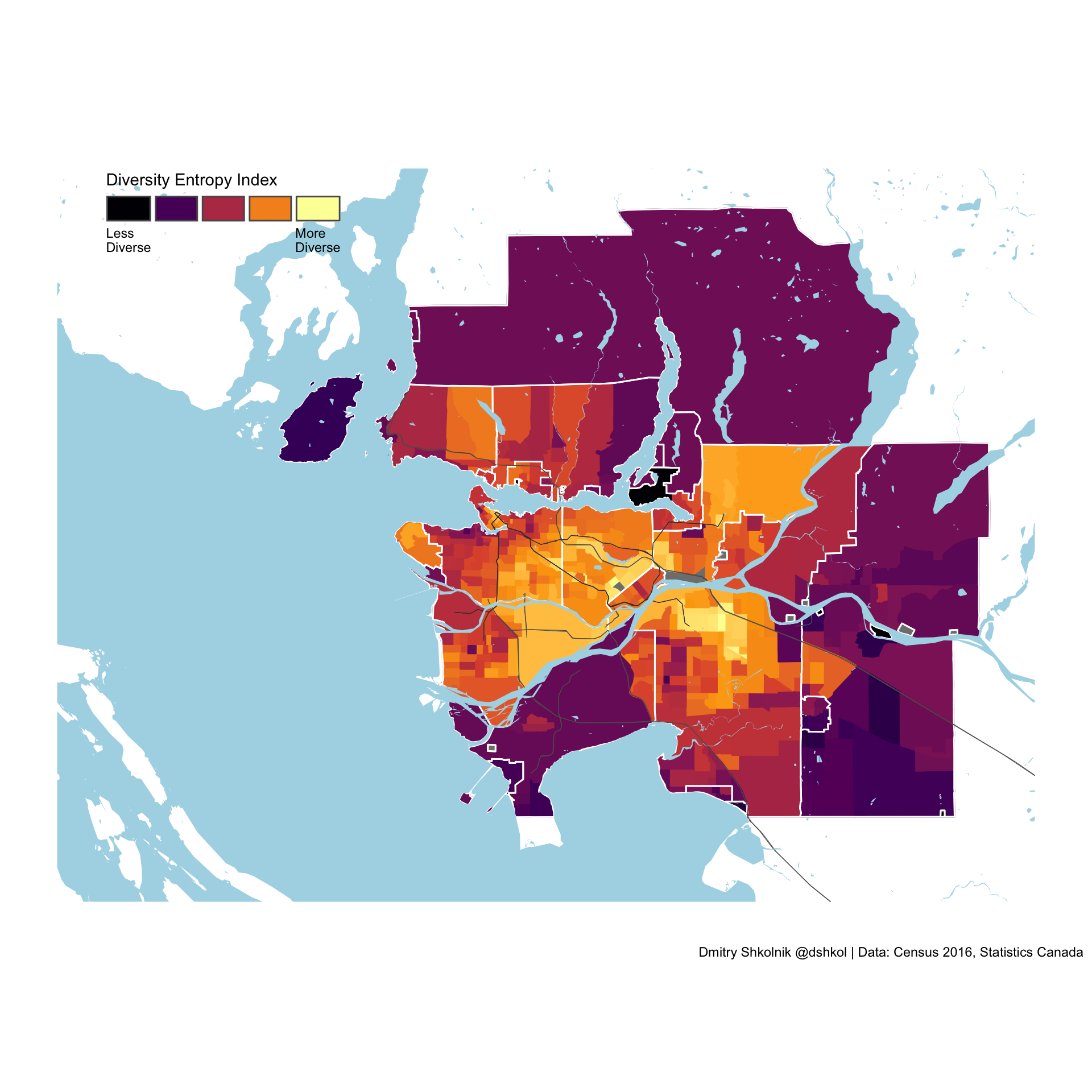 Some of the most diverse Census tracts in Canada are within in Surrey, Burnaby, and Coquitlam. It is no surprise that these municipalities are the most diverse in the Vancouver metropolitan area.
The most diverse cities in Metro Vancouver
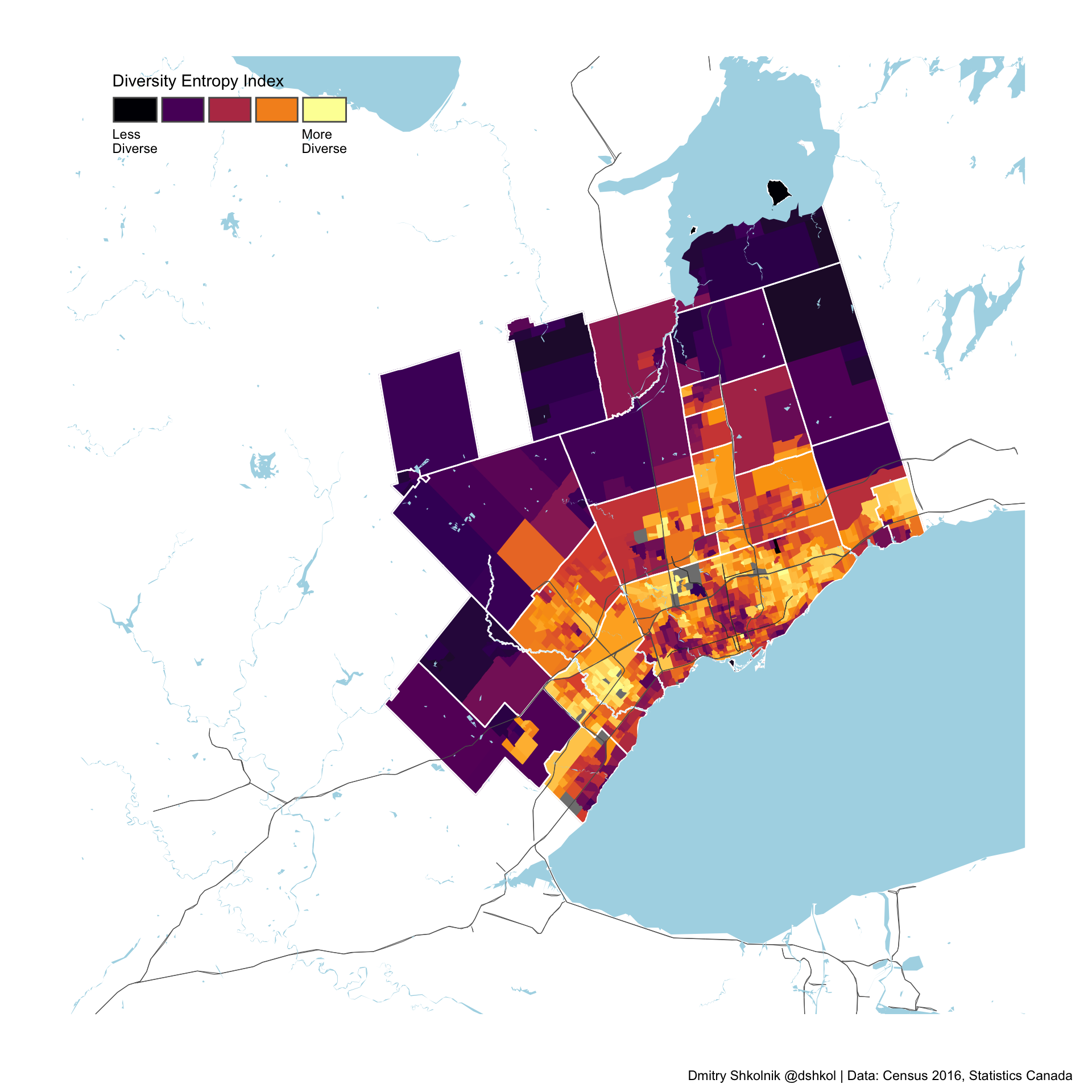
Toronto
Montreal
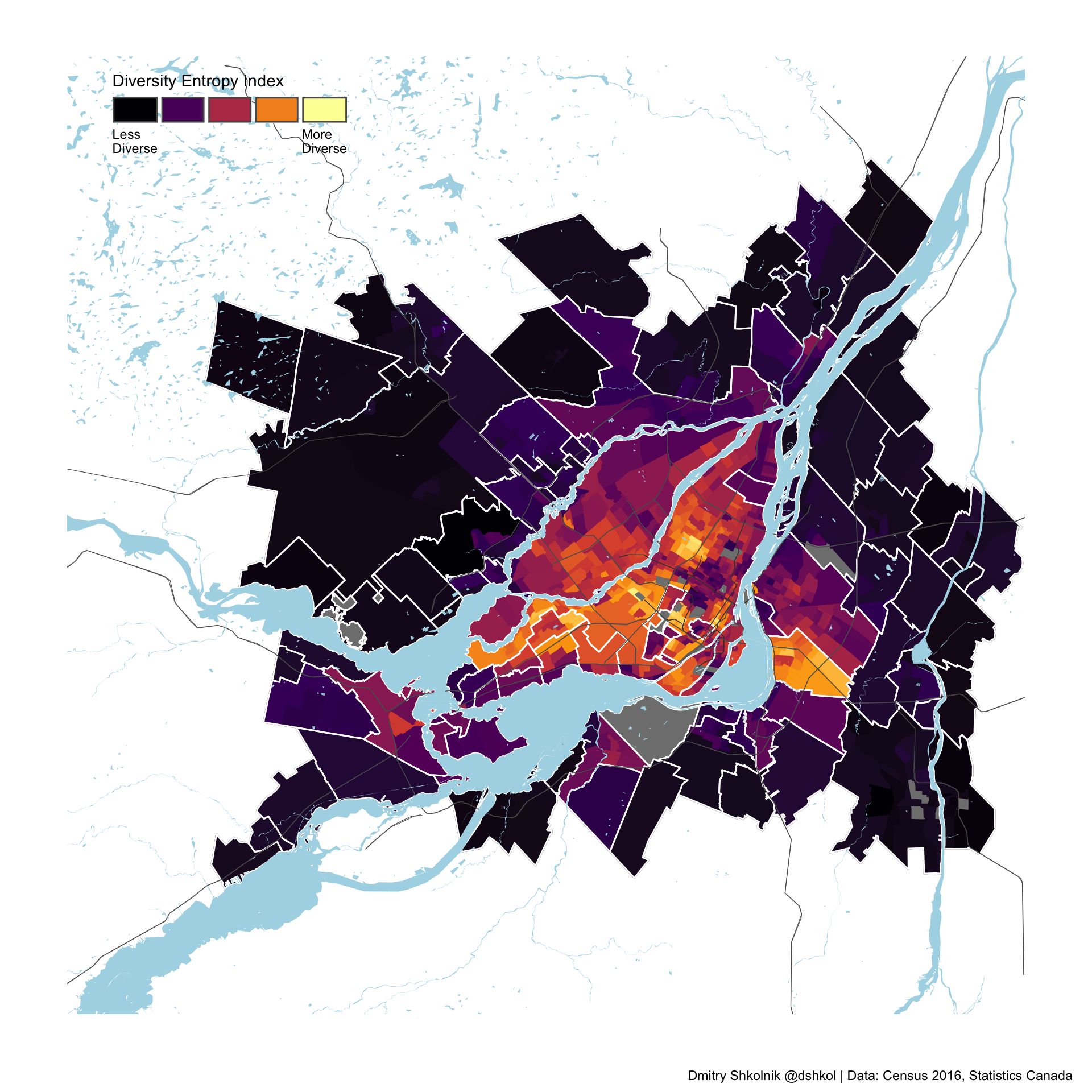
Calgary
The most diverse cities in Canada are all in the GTA and Metro Vancouver
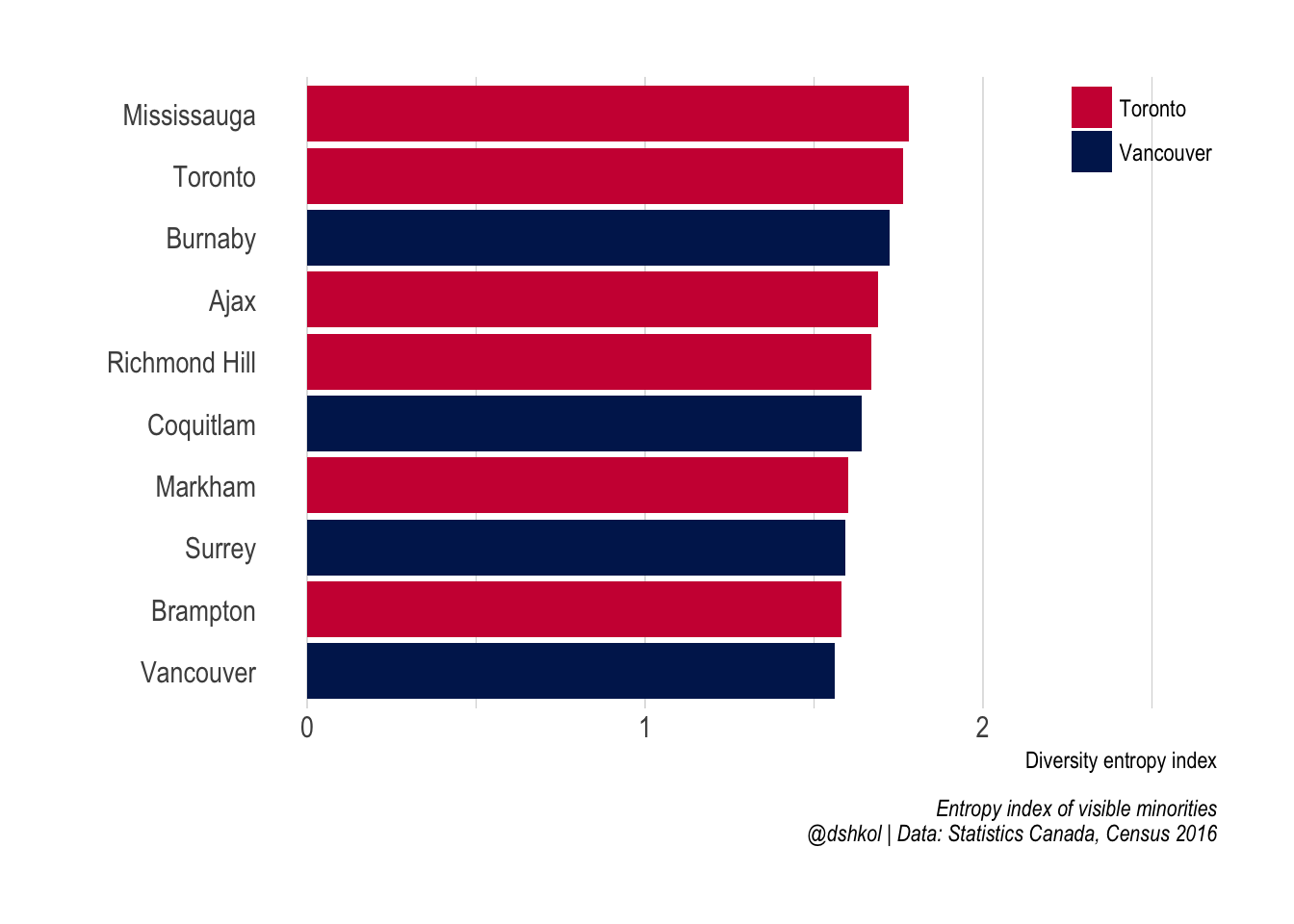 The ranking of most diverse cities in Canada (with population greater than 50,000) is dominated by two metro areas. Anybody familiar with Canada would have expected Metro Toronto and Metro Vancouver to feature prominently, but all of the top 10 Census subdivisions in Canada are within these two regions.
The most diverse municipalities outside of these two metro areas are Brossard (Montréal) and the city of Edmonton (Edmonton) at 11th and 16th most diverse, respectively.
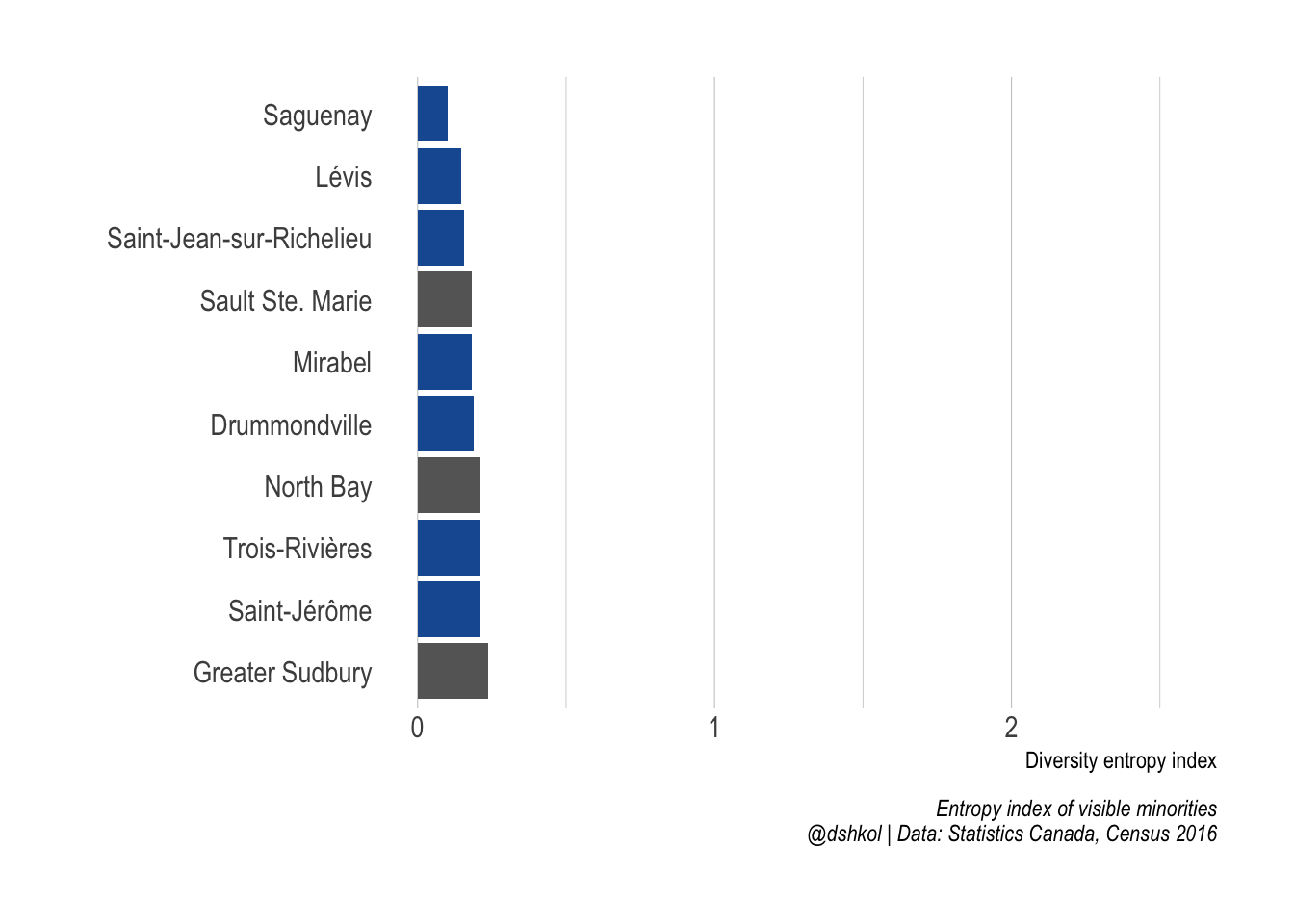
The least diverse cities in Canada are in Quebec (and Ontario)
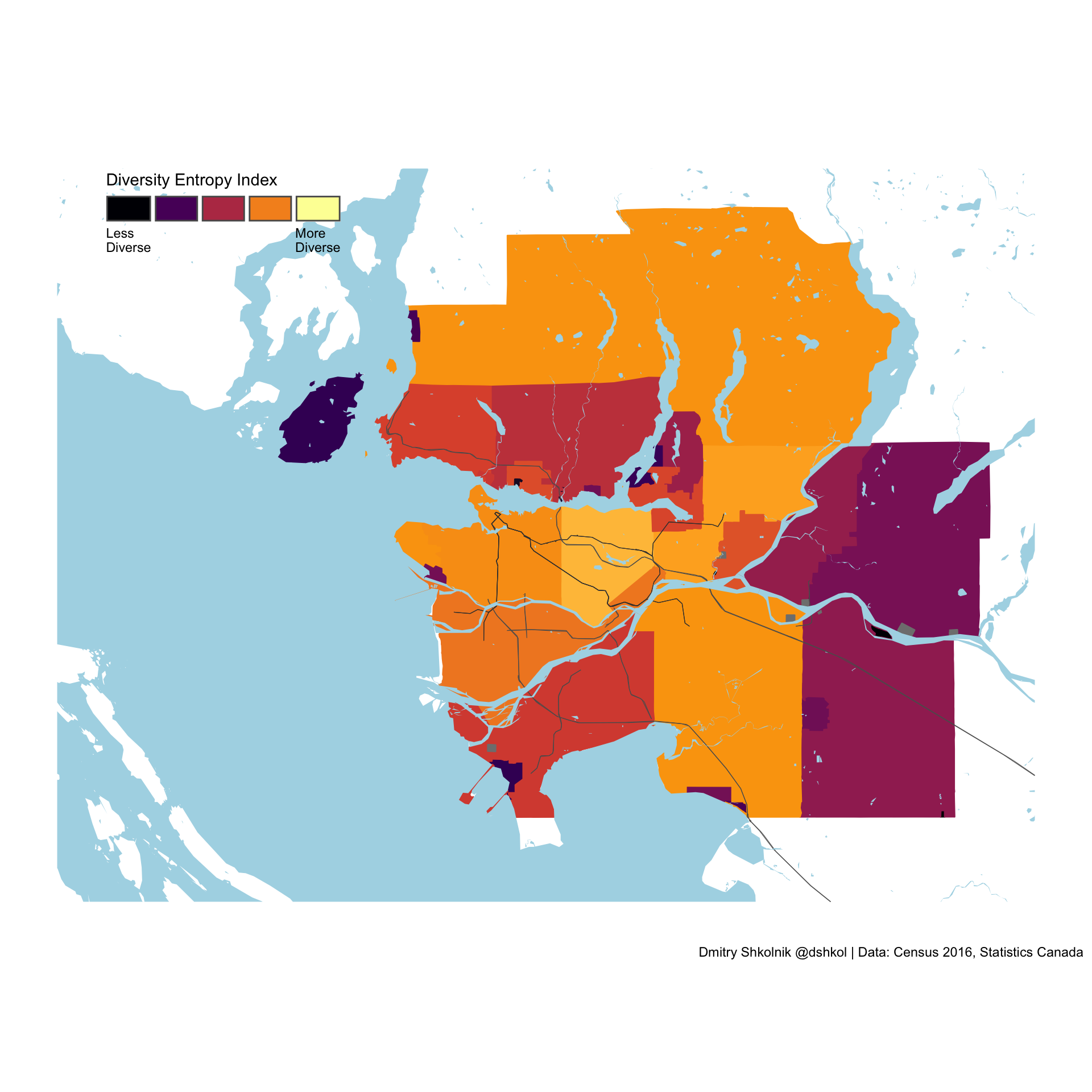
Segregation
With the diversity of these cities defined, calculating the extent of segregation is straight-forward. Returning to the Theil measurement of multigroup entropy, segregation is the measure of the difference between the diversity of the entire system (i.e. city) and the weighted average diversity of the individual elements that make up that city (i.e. Census tracts).
The most and the least segregated large cities in Canada
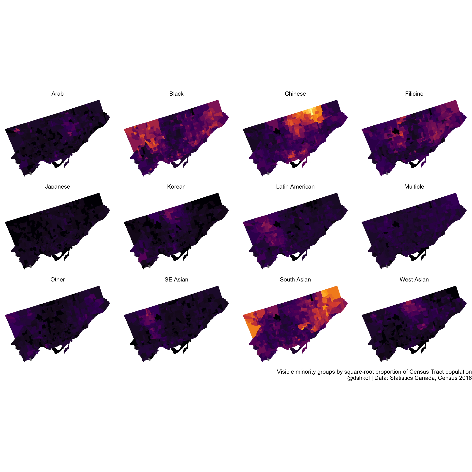
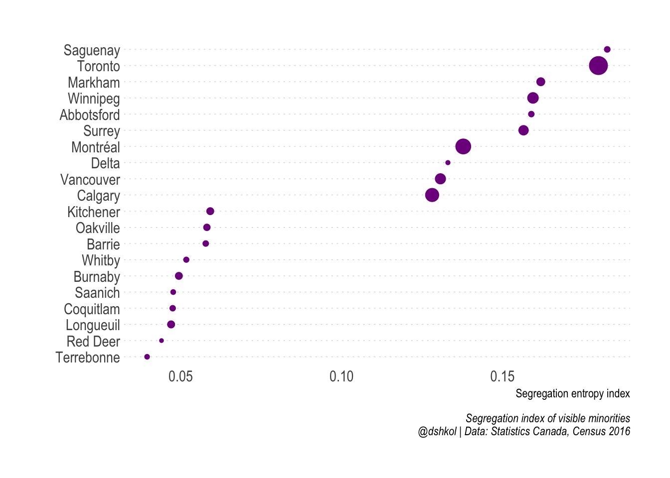 Several of the cities that appear near the top of this list were previously highlighted as some of the most diverse in the country. This goes back to the idea that segregation depends entirely on how groups are distributed within a geographic area. Toronto (the City of), while incredibly diverse by any metric when looked as a whole consists of visible minority groups that are relatively concentrated within specific areas of the city.
Compare, for example, group distribution in Toronto:
 And in Longueuil, QC, where the different groups that are present are more evenly distributed across the entire city.
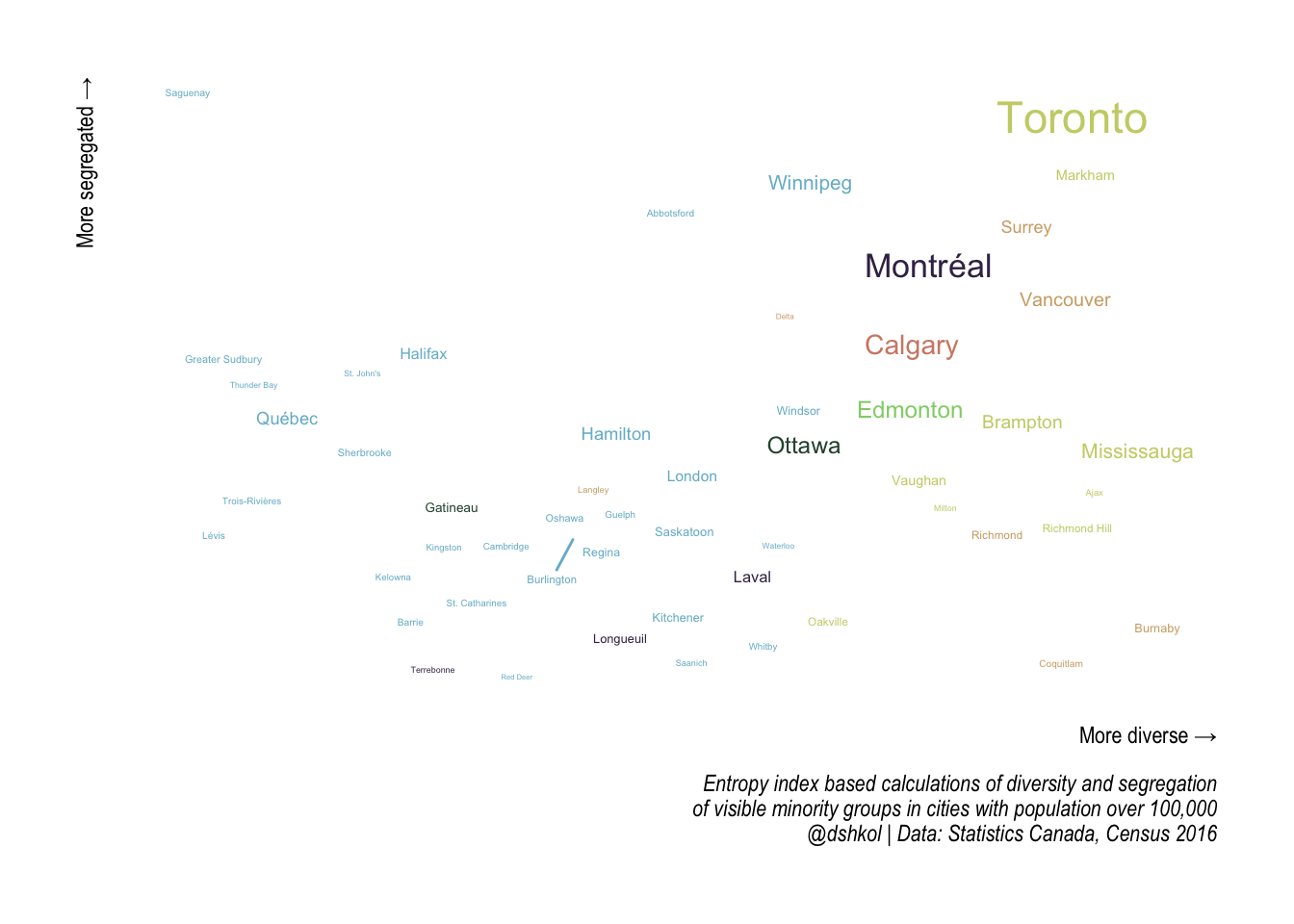
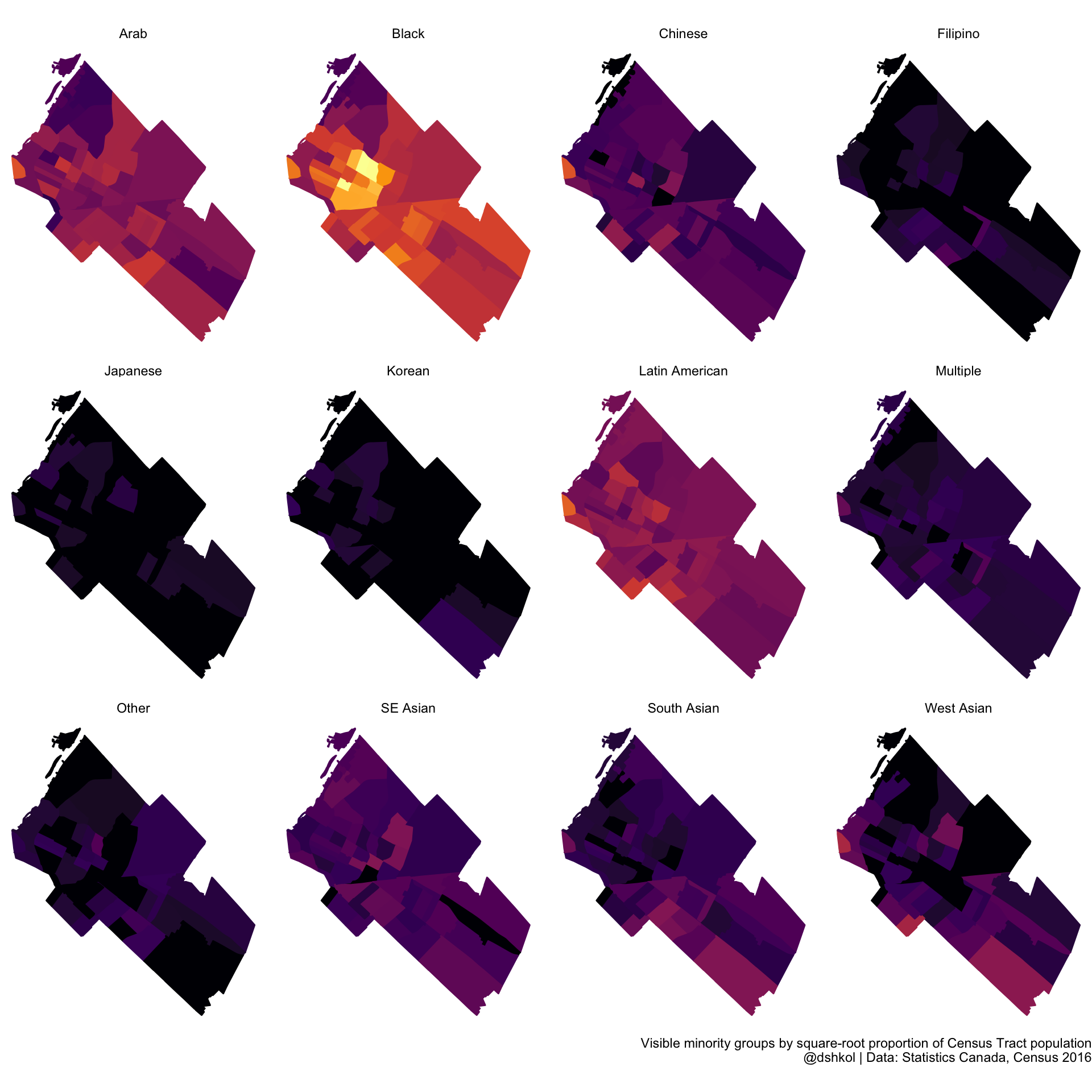 The takeaway is that cities can be both relatively diverse and relatively segregated. Putting it all together, we can construct a simplified taxonomy by placing Canadian cities along both a diversity index axis and a segregation index axis at once.
Toronto, Saguenay, Burnaby, and Terrebonne
 In part two of this post I plan to look at how these areas have changed over the last few Census periods going back to 2006.
A final comment
The measures of diversity and segregation used in this post are sensitive to the assumptions around which demographic characteristics are the basis for the measurements. The same analysis could be performed with birthplaces of immigrant populations, with languages spoken at home, or, really, with any set demographic variables that profile an area and the numbers could well likely be different than what is presented here. An alternative approach could use ethnic origin instead of visible minority, but the Canadian Census has an incredibly large number of ethnic origins represented. Canada is a country with a rich immigrant history and the majority of Canadians can trace their origins to a few (or many) ethnic groups; however, the broad groups that people think of when they think about diversity, integration, and segregation tend to be visible minority groups.
The entropy-based approach for measuring diversity and segregation works well for comparing places that have the same type of data. With the data in the Canadian Census, it becomes straight-forward to directly compare any Canadian cities against one another in relative terms. Where this approach begins to struggle is when we think about whether or not the cities in question are actually segregated or not, or if they are merely slightly less integrated than one another. This approach also struggles in forming a valid comparison with data from places that have different data, even if the calculation methodology is the same. As a result, it is difficult to say segregation in Canadian cities compares with, say, what we would observe using similar approaches in American cities. My own sense from this exercise is that Canadian cities are all relatively integrated given their high levels of diversity. It is both outside the scope of this piece and outside my expertise to answer the question of why that may be.
Code
All of the R code for the analysis and visuals in this post is embedded within this page as RMarkdown code. It’s hidden by default but can be viewed on Github. All of the data is accessed and retrieved using the cancensus package. The ability, thanks to this package, to work with hierarchical variable structures and to iterate analysis across many regions and variables make something like this a relatively easy thing to put together. In addition, this post relies on a number of other great R packages:
library(cancensus) # access, retrieve, and work with Census data
library(cancensusHelpers) # personal use helper functions - development
library(dplyr) # data manipulation
library(purrr) # recursive programming
library(tidyr) # reshaping data
library(sf) # spatial data and visualization
library(ggplot2) # visualization
library(ggrepel) # for smarter labelling
library(hrbrthemes) # typographic theme elements
library(rmapzen) # vector tiles for maps