TL;DR: Small multiples maps are one of my favourite ways to communicate multiple variables with a quantitative and spatial dimension. This example uses small multiples to show the distribution of the most spoken non-English languages in the Toronto CMA. Scroll to the end to see the results.
After seeing the excellent electoral results maps from the Berliner Morgenpost, I wanted to experiment with a similar approach for an alternative take on my maps of linguistic diversity in Canadian cities.
The maps in my post highlighted areas where overall diversity was greatest, but they don’t do a good job of providing detail about the heterogeneous makeup of each area, and which languages particularly stand out. Maps which highlight the most first (or second, or third) most prominent language are easy to find but they too fail to show heterogeneity.
Dot density maps are a frequently used approach that shows both intensity and distribution on a map. You can check out this cancensus vignette for a simple example using Census languages.
Dot density maps can start looking a little busy when there’s more than a few categories plotted simultaneously. As the number of categories being displayed increases, perceptual distance between colours decreases and there is less and less negative space left over. Smaller categories are visually dominated by categories with larger numbers. Small multiples are an alternative approach that mitigates the effect of overlapping data. There are several ways of creating small multiples in R and this post goes through a couple methods that take advantage of ggplot2 faceting and R’s grid approach to graphical objects.
Small multiples
Tufte introduces small multiples in The Visual Display of Quantitative Information (1983) and in Envisioning Information (1990). He explains that they are:
Illustrations of postage-stamp size are indexed by category or a label, sequenced over time like the frames of a movie, or ordered by a quantitative variable not used in the single image itself.
There’s a few advantages to using small multiples but they main one is that they allow you to display lots of variables at the same time, and allows someone looking at that information to perceive the how those variables differ from one another in the same space. You can use small multiples for all types of multivariate plots, whether simple scatter and bar plots, or, as in this case, choropleth maps.
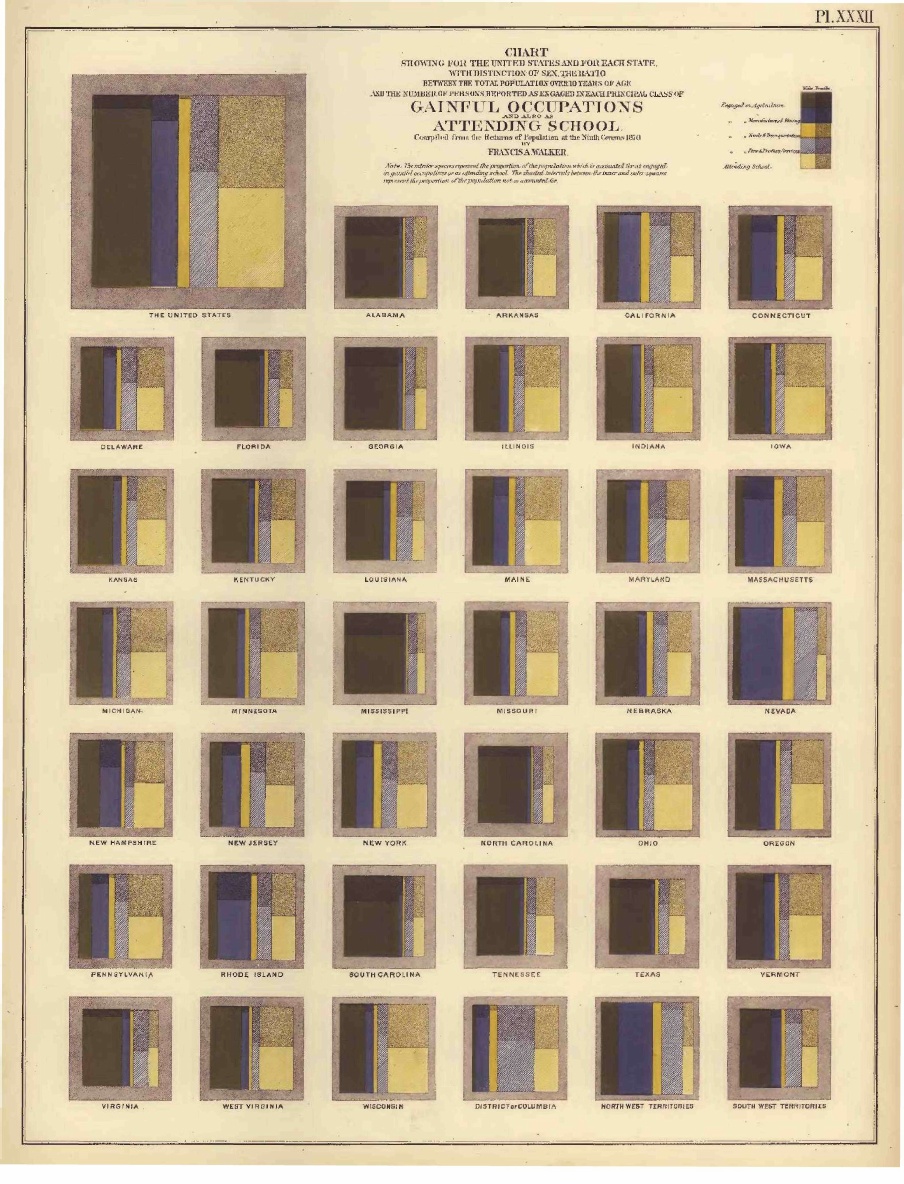
 An early example of a small multiples plot from 1874
 A more contemporary example from Domino Data Labs
Getting the data
For this example, let’s take a look at the top-10 languages spoken in the Toronto CMA. Language spoken most often at home and mother language are the two primary Census language variables in the Canadian Census. This post is more of a quick example, but there’s a lot more detail about retrieving Census language data with the cancensus R package in this post for those who are interested.
# Install package if not already installed
# devtools::install_github("mountainmath/cancensus")
library(dplyr)
library(cancensus)

#options(cancensus.api_key = "your_key)
# options(cancensus.cache_path = "cache_path")
And grabbing the language data from the Census…
dataset <- "CA16" # Selecting data from the 2016 Census

language_parent <- search_census_vectors("Single Responses", dataset) %>%
  filter(vector == "v_CA16_1358")

# Select all leaf nodes of this vector. The parameter TRUE returns only the finite leaves among child nodes.
language_children <- language_parent %>%
  child_census_vectors(TRUE)

# Store the vector list for later
language_vectors <- language_children %>% pull(vector)
Figuring out the top-10 languages spoken in the Toronto CMA is pretty straight forward from here.
# Select Region
regions_list_tor <- list_census_regions(dataset) %>%
  filter(level=="CMA", name == "Toronto") %>%
  as_census_region_list

# Grab Census data
toronto10 <- get_census(dataset, level = "CMA", regions = regions_list_tor , vectors = language_vectors, geo_format = NA, labels = "short")

# Get the top 10
toronto10 <- toronto10 %>%
  tidyr::gather(key = language, value = lang_count, v_CA16_1364:v_CA16_1937) %>%
  top_n(10, lang_count) %>%
  inner_join(list_census_vectors(dataset), by = c("language" = "vector")) %>%
  select(language, label, lang_count) %>%
arrange(desc(lang_count))toronto10## # A tibble: 10 x 3
## language label lang_count
## <chr> <chr> <dbl>
## 1 v_CA16_1364 English 3836770
## 2 v_CA16_2060 Cantonese 182750
## 3 v_CA16_2066 Mandarin 179670
## 4 v_CA16_1916 Punjabi (Panjabi) 116045
## 5 v_CA16_1925 Urdu 78105
## 6 v_CA16_1757 Tamil 76095
## 7 v_CA16_1958 Spanish 70370
## 8 v_CA16_1937 Persian (Farsi) 67315
## 9 v_CA16_1727 Tagalog (Pilipino, Filipino) 63985
## 10 v_CA16_1814 Russian 53670The linguistic diversity maps looked at languages spoken at the DA level, but that involves plotting a huge number of polygons. The original maps stretched the capabilities of R’s graphical engine, and using that level of detail for small multiples is overkill. As each plot itself is quite small, there should be not much loss of detail by stepping up to a higher Census geographic level like Census tracts.
language_vectors <- toronto10 %>% pull(language)
# I also add the Single Response Total to calculate shares and percentages for each language
language_vectors <- c(language_parent %>% pull(vector), language_vectors)

toronto10_ct <- get_census(dataset, level = "CT", regions = regions_list_tor , vectors = language_vectors, geo_format = "sf", labels = "short")
Quick small multiples with facet_wrap
The new spatial graphical layer in ggplot2 called geom_sf is very useful because it allows us to take advantage of the ggplot2 ecosystem. This is particularly useful when it comes to making small multiples as we can take advantage of the facet_wrap and facet_grid options for splitting up a single plot into multiple smaller plots by some categorical variable.
To take advantage of facet_wrap within the logic of ggplot the data has to be in long format.
toronto10_ct <- toronto10_ct %>%
  tidyr::gather(key = language, value = lang_count, v_CA16_1364:v_CA16_1814) %>%
  rename(`Single Responses` = v_CA16_1358) %>%
  filter(language != "v_CA16_1364") %>%
  mutate(lang_share_sr = lang_count/`Single Responses`,
         lang_share_sr = ifelse(is.na(lang_share_sr),0,lang_share_sr)) %>%
  inner_join(list_census_vectors(dataset), by = c("language" = "vector"))
# Requires current dev version of ggplot2
# devtools::install_github("tidyverse/ggplot2")
library(ggplot2)
# Define a set of ggplot theme elements for clean minimal maps so that the code is tidier
map_theme <- theme_void() +
theme(plot.title=element_text(face="bold", hjust = 0.5)) +
theme(plot.subtitle=element_text(hjust = 0.5)) +
theme(plot.caption=element_text(size=8, margin=margin(t=10), hjust = 0.95))
ggplot(toronto10_ct) +
geom_sf(aes(fill = lang_share_sr^(1/2), colour = lang_share_sr^(1/2))) +
facet_wrap(~label, ncol = 3) +
map_theme + scale_fill_viridis_c("", guide = FALSE, option = "magma") +
coord_sf(datum = NA) +
scale_colour_viridis_c("", guide = FALSE, option = "magma")
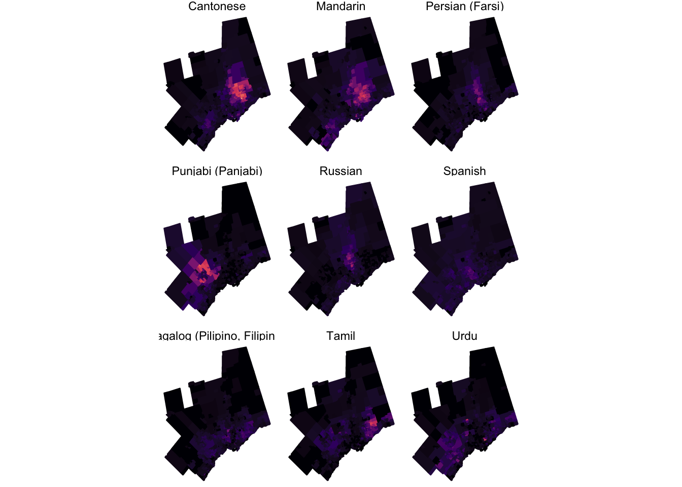
This map highlights that different languages are not distributed uniformly across the Toronto metropolitan area. Sure, some like Spanish are pretty evenly distributed, but others show a clear concentration in some specific areas.
Using facet_wrap is convenient not just because it is a concise approach, but because it ensures that your scales and dimensions are consistent across each panel. The downside to using facet_wrap is that it can be pretty difficult to customize individual panels. An alternative approach to small multiples is to create each plot individually (with required customization) and then arrange the plots together using the functions in the grid and gridExtra packages.
Manual small multiples with grid layouts
Graphical objects in R are called grobs and there are both low- and high-level functions for dealing with how these objects are displayed and arranged in graphical output. You can find a detailed vignette on arranging grobs included with the gridExtra package.
This approach requires a fair bit more manual work. I’ve adapted some of the code from the Berliner Morgenpost approach that inspired this post.
Start by defining colour palettes for each language. I’ve picked these colours at random, but this approach is most useful when colours represent something like political party or affiliation.
toronto10_ct <- toronto10_ct %>%
  mutate(colour = case_when(label == "Cantonese" ~ "#07cc00",
                            label == "Mandarin" ~ "#8C0315",
                            label == "Persian (Farsi)" ~ "#066F6F",
                            label == "Punjabi (Panjabi)" ~ "#ff6700",
                            label == "Russian" ~ "#00239f",
                            label == "Spanish" ~ "#9f0048",
                            label == "Tagalog (Pilipino, Filipino)" ~ "#9f6000",
                            label == "Tamil" ~ "#ff00db",
                            label == "Urdu" ~ "#325600"))
Next, create a function to create a ggplot map for each entry
small_map <- function(df, i) {
  sub_df <- df %>% filter(label == language_list[i])

  map <- ggplot(sub_df) +
    geom_sf(aes(fill = lang_share_sr^(1/2), colour = lang_share_sr^(1/2))) +
    map_theme + coord_sf(datum = NA) +
    scale_fill_gradient(space = "Lab", name=" ", low="#F4F4F4", high=unique(sub_df$colour), guide=FALSE) + labs(title = language_list[i]) +
    scale_colour_gradient(space = "Lab", name=" ", low="#F4F4F4", high=unique(sub_df$colour), guide=FALSE) + labs(title = language_list[i]) +
    theme(plot.title = element_text(colour = unique(sub_df$colour)))
  return(map)
}
Once the function is defined, we iterate over each of the top languages (excluding English) with a for loop and store each resulting ggplot grob in a list.
language_list <- unique(toronto10_ct$label)
plotlist <- list() # initialize an empty list to fill

for(i in 1:length(language_list)) {
  plotlist[[i]] <- small_map(toronto10_ct, i)
}
With the objects stored in a list, we use the gridExtra package to arrange the graphical objects to our liking.
library(gridExtra)
do.call("grid.arrange", c(plotlist, ncol=3)) 
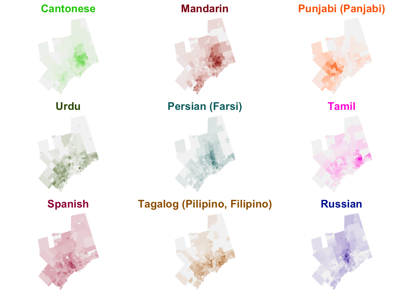
Note how the titles are coloured. That type of customization is easier when generating each map individually. If I was working on a small multiple plot for publication, I would appreciate the additional flexibility and customizability that’s offered through this approach, but it’s definitely more work to implement.
So to summarize…
The advantages to using facets for small multiples:
- Easy to implement - far fewer lines of code
- Option to automatically generate consistent scales
- Shared ggplot
aeslogic across multiples - Quicker to render
And the advantages to using grids for small multiples:
- More customization - flexibility with theme elements and colour palettes
- More control over placement of objects and non-standard layouts/asymmetric layouts
- Not limited to ggplot graphical objects - can use any R graphics objects