While putting together the data for the longer post on measuring and visualizing diversity and segregation in Canadian cities, I wanted to see if there was an intuitive way to compare similarity of cities across multiple Census demographic variables at the same time. Comparing across many Census variables at once requires us to think across many dimensions at once.
As our eyes really perceive in at best four dimensions, visualizing many dimensions requires a reduction in the number of dimensions from many to the two (or three) dimensions that best allow for visual interpretation. Typically this is done through dimension reducing approaches like principle components but, increasingly, t-SNE has become a preferred technique for embedding highly dimensional data in to lower dimensional space while preserving local structure.
What is t-SNE?
T-distributed Stochastic Neighbour Embedding is a non-linear dimensionality reduction algorithm for turning high-dimensional data into two or three dimensional representations. It is primarily used for visualizing high-dimensional data in a way that preserves the relationships between similar observations and is regularly used in applications requiring interpretation of high-dimensional data such as bioinformatics, explaining neural nets, and even music analysis.
Some notes on interpreting t-SNE.
It’s important to remember that t-SNE is not really an algorithm for clustering or classifying data. Rather it’s a highly effective and popular technique for visualizing relationships in high-dimensional data. t-SNE does not preserve information on distance or density between data points, so the resulting visualizations require careful interpretation.
The sizes and positions of clusters formed by a t-SNE embedding do not mean much. The important thing is the proximity of individual data points to their neighbours. The distance between clusters is not informative. Some clusters appear closer together but this does not imply greater similarity if there is good separation. A t-SNE visual is good for showing relationships in local space but not in global space.
The results are highly dependent on hyper-parameters. Changing parameters for perplexity, learning rate, iterations, exaggeration factors can lead to very different looking shapes, and there isn’t really an automatic way to tune these parameters. Stability, though, is a good indicator that there is something there.
Data and preprocessing
Calculating the proportions for any demographic Census variable is relatively straightforward using the cancensus package largely thanks in part to functions taking advantage of the hierarchical variable within the Census. The child_census_vectors function returns all descendant variables for a given parent vector. In this case, we look at visible minority status and return the specific reference vectors for each specific group.
# Using the cancensus package to get Census demographic data for Canadian cities
library(cancensus)
library(dplyr)

## Identifying the vectors for visible Minority status
parent_vector <- "v_CA16_3954"
minorities <- list_census_vectors("CA16") %>%
  filter(vector == "v_CA16_3954") %>%
  child_census_vectors(leaves_only = TRUE) %>%
  pull(vector)

minority_vectors <- c(parent_vector, minorities)
With the relevant vectors identified, I use a custom function to pull down the numbers for the Census Subdivisions that make up a given Census Metropolitan Area and then quickly calculate the proportion thanks to the new non-standard evaluation tools in the dplyr package.
# A function to download census variables and calculate proportions for a given CMA
csd_props <- function(cma) {
  cma.csd <- get_census("CA16", regions=list(CMA=cma),
                        vectors = minority_vectors, level = "CSD",
                        labels = "short", geo_format = NA)

  base_pop <- quo(v_CA16_3954)
  csd.props <- cma.csd %>%
    group_by(GeoUID) %>%
    mutate_at(minorities, funs(prop = (./!!(base_pop)))) %>%
    select(`Region Name`, Population, GeoUID, ends_with("_prop")) %>%
    ungroup()
  return(csd.props)
}
With the csd_props defined and ready to go, we can simply map the function over a list of all Canadian CMA codes to calculate proportions for every CSD within a CMA using the incredibly useful map_df function from the purrr package.
# Get list of all CMA codes
cmas <- list_census_regions("CA16") %>% filter(level == "CMA") %>% select(region, name, pop)

# Map function to each CMA
all_csd_props <- purrr::map_df(cmas$region, .f = csd_props)

# Filter to just Census subdivisions with a min pop of 50,000
larger_csd_props <- all_csd_props %>% filter(Population > 74000)

# Turn data frame into a matrix of proportions
prop_matrix <- larger_csd_props %>%
  select(starts_with("v_")) %>%
  as.matrix()
The last stage in data preprocessing is to filter our data to include larger cities and municipalities only before constructing a simplified matrix of variable proportions to use for t-SNE visualization.
Two dimensional embedding of visible minority proportions by city
The Rtsne package provides an R API for generating t-SNE embeddings from matrices. By default, Rtsne applies PCA for preprocessing and provides options for normalization and scaling. In this case, working with proportion data, the numbers are already normalized, but other types of variables may require normalization to be effectively used for t-SNE.
T-SNE embeddings are extremely sensitive to hyperparameter selection for perplexity, iterations (steps), and other settings like exagerration factor. There is not really a correct setting for hyperparameters and different datasets will require some trial and error to identify appropriate settings. Perplexity is probably the most consequential parameter, as it more or less determines how many neighbours embeddings should consider. Perplexity is typically set between 10 and 50 and the maximum perplexity depends on the size of the matrix and the number of elements we are looking at. Ultimately it depends on the data itself: how large it is, how complex, and how much natural structure there may be in it. Setting perplexity too low may not result in meaningful convergence in embeddings, while high perplexity can lead to convergence where there is none in reality. At particularly high settings for perplexity the t-SNE visualization will look like individual lines. Higher perplexity also increases processing time but generally improves groupings in reduced dimensional space.
# Load Rtsne package
library(Rtsne)

csd_tsne <- Rtsne(prop_matrix, perplexity = 5,
                  exaggeration_factor = 2,
                  max_iter = 2000)

# Store matrix of positions in 2-dimensional space for plotting
csd_tsne_2d = as.data.frame(csd_tsne$Y)

# Add names for labelling
# `clean_names2` is a helper function to tidy up names, not needed for other data, but can be found in the code for this page on github if needed.
csd_tsne_2d$name = larger_csd_props %>%
  clean_names2() %>% pull(`Region Name`) %>%
  as.character()
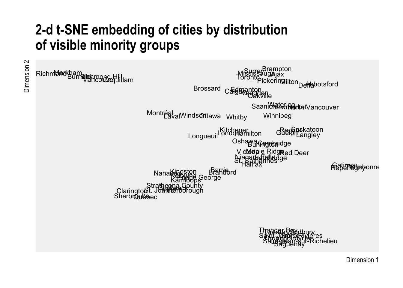
Finally we can visualize the results using the embeddings as X and Y coordinates. Every t-SNE run will produce a different result unless there is very well defined structure within the data. Changing hyper-parameters will also produce different results so interpretation of these plots requires a lot of care. Specifically we want to look for tight groupings of cities, even pairings, that suggest close similarity across many dimensions.
# Visualize the layout
library(ggplot2)
library(hrbrthemes) # clean typography

ggplot(csd_tsne_2d, aes(x=V1, y=V2)) +
  geom_text(aes(label = name), size = 3) +
  labs(x = "Dimension 1",
       y = "Dimension 2",
       title = "2-d t-SNE embedding of cities by distribution\nof visible minority groups") +
  theme_ipsum() +
  theme(axis.text.x=element_blank(),
        axis.text.y=element_blank(),
        panel.grid = element_blank(),
        panel.background = element_rect(fill = "grey95", colour = NA))
While the results of this embedding suggest there is a bit of random noise rather, some clear groups of cities do emerge. In one tight grouping you have Vancouver, Richmond, Burnaby, Coquitlam, Markham, and Richmond Hill - all of which are large diverse cities with a large Asian population within the Lower Mainland or the GTA. Another grouping occurs with some of the other municipalities in the Lower Mainland and the GTA with Brampton, Surrey, Mississauga, Ajax, and Abbotsford. Sudbury, Saguenay, and Thunder Bay look to have similar proportions of different visible minority groups, as does Calgary, Edmonton, Vaughan, Oakville, and Saanich. Overall, there are a number of these types of groupings that can be spotted in the resulting embedding.
Occupation of work
The same approach can be quickly replicated to look at a different set of variables such as occupation, industry, or education.
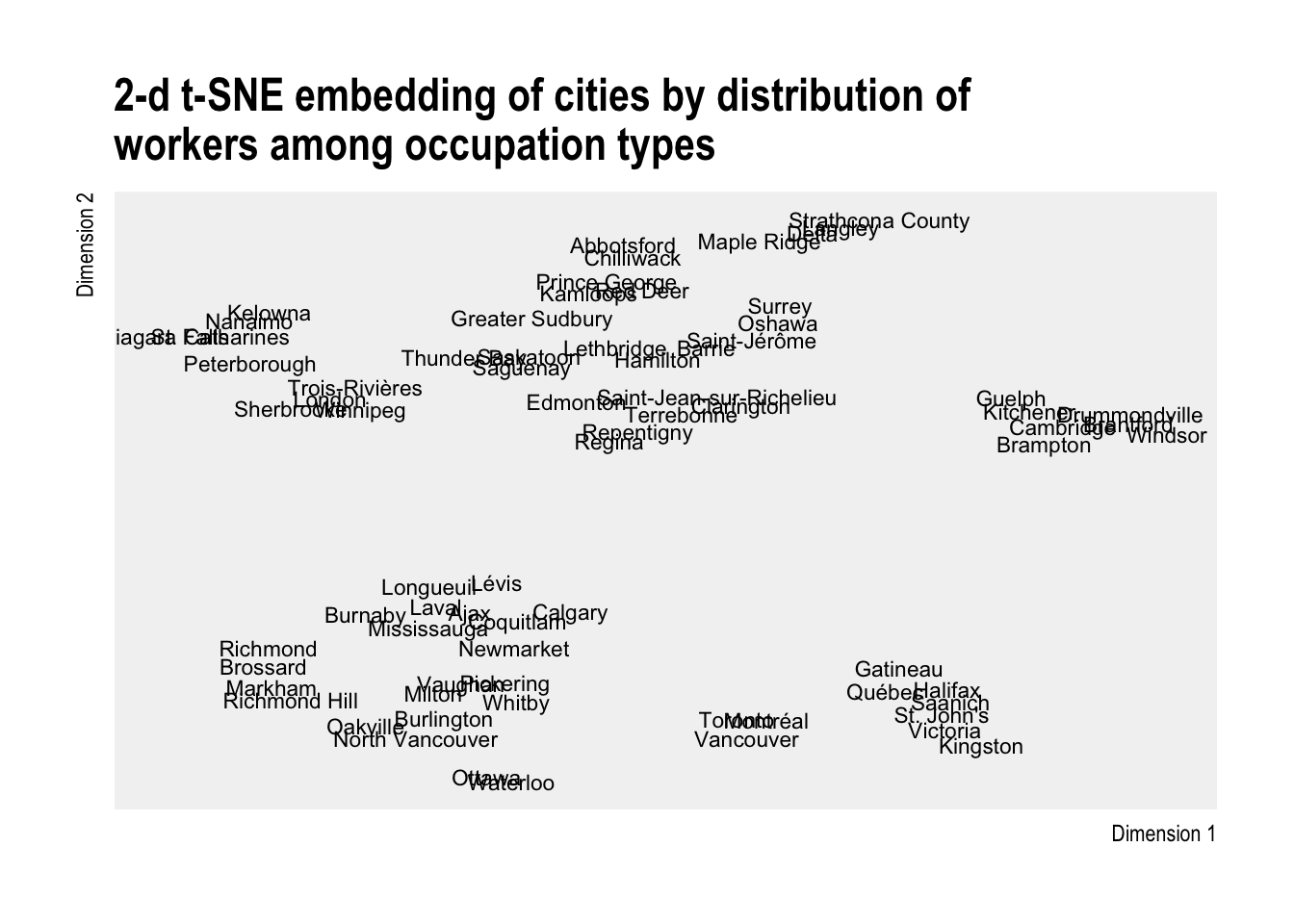
 The t-SNE embeddings for occupation group show some interesting groupings. Toronto, Vancouver, and Montréal are large cosmopolitan urban centres with a diversity of occupations that structurally resemble one another more than they do other their neighbouring municipalities. A few other interesting groups pop out as well: a Provincial capital group with places like Victoria, Halifax, Québec, and St. Johns in one group, along side presumably similar cities like Kingston and Gatineau. Despite being the national capital, Ottawa is most similar to Waterloo, likely due to the strong technology and education sectors in both cities.
Major industry groups
By looking at major industry group instead, we can better explore sector similarity across the country.
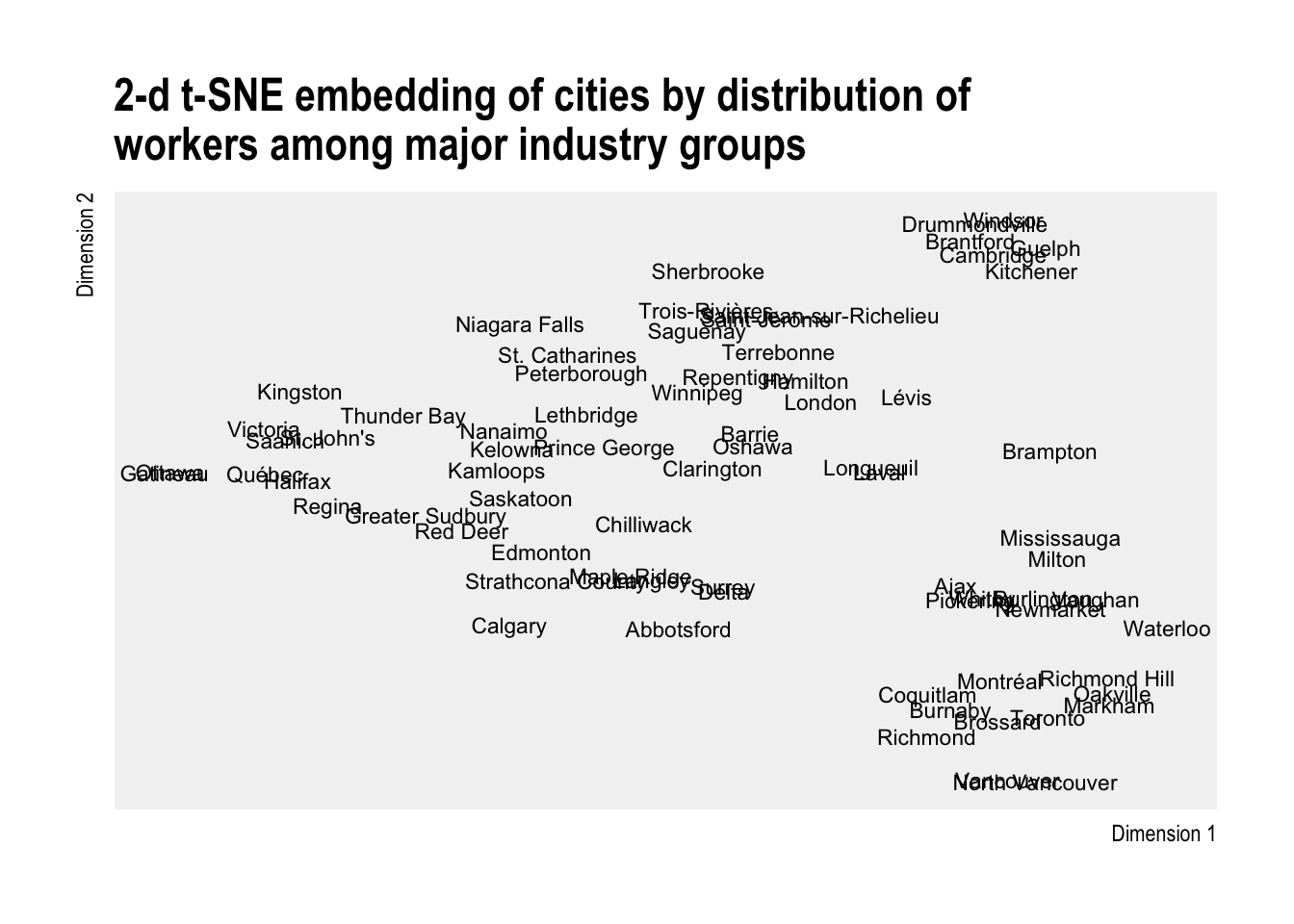
 In this case we see some cities almost neatly overlapping one another suggesting very close similarity. When we look at some of these groups the results are obvious in some cases: Ottawa and Gatineau are home to much of the federal government; and perhaps less so in other cases. The similarity of GTA suburbs comes out clearly, as do the Fraser Valley municipalities and some other clearly visible groups.
Post-secondary major
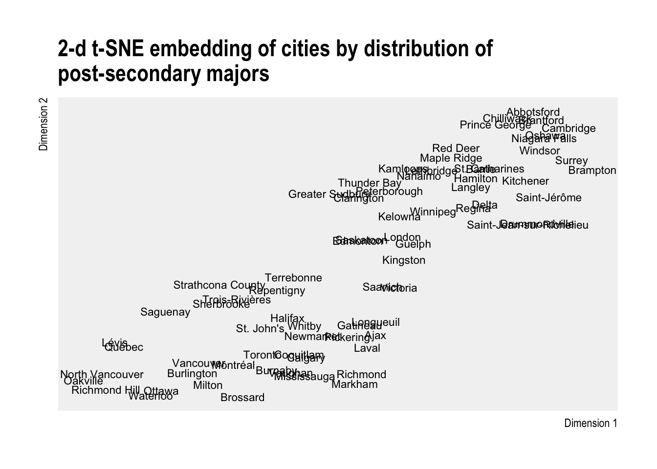
Finally we take a look at whether there are hidden patterns in where Canadian adults (25-64) with post-secondary degrees are settling using post-secondary major of study as the input set of dimensions to embed.

If anyone wants to make their own representation with different variables the code to put together the data and visualizations for this post is on Github. Send me a note via email or Twitter - I would love to see other takes on this approach.
Recommended further reading on t-SNE techniques
- (Van der Maaten and Hinton) Visualizing Data using t-SNE
- the paper that introduced the t-SNE
- (Linderman and Steinerberger) Clustering with t-SNE, provably
- Good paper on hyper-parameter usage, particularly early exaggeration.
- Good paper on hyper-parameter usage, particularly early exaggeration.
- Distill: How to Use t-SNE Effectively
- a great interactive article with an emphasis on how hyper-parameters affect t-SNE results.