Why spatially constrained clustering?
Clustering data is well-covered terrain, and many methods also apply to spatial data. The advantage of spatially constrained methods is that it has a hard requirement that spatial objects in the same cluster are also geographically linked. This provides a lot of upside in cases where there is a real-life application that requires separating geographies into discrete regions (regionalization) such as designing communities, planning areas, amenity zones, logistical units, or even for the purpose of setting up experiments with real world geographic constraints. There are many applications and many situations where the optimal clustering, if solely using traditional cluster evaluation measures, is sub-optimal in practice because of real-world constraints.
In practice, unconstrained clustering approaches on data with spatial characteristics will often still have a regionalization element because real-world data tends to have spatial patterns and autocorrelation but if we want to ensure that all objects are in entirely spatially-contiguous groups we can turn to algorithms specifically designed to the task. There are several used in the geo data science community, but I have a personal preference for the skater algorithm available in R via the spdep package because it is relatively well-implemented and well-documented. This post breaks down how the algorithm works in an illustrated step-by-step example using real-world census data.
The SKATER algorithm
Efficient regionalization techniques for socioeconomic geographical units using minimum spanning trees. (Assunçáo et al, 2006) introduced a regionalization approach using graph partitioning for efficient division of spatial objects while preserving neighbourhood connectivity. The SKATER (Spatial ’K’luster Analysis by Tree Edge Removal) builds off of a connectivity graph to represent spatial relationships between neighbouring areas, where each area is represented by a node and edges represent connections between areas. Edge costs are calculated by evaluating the dissimilarity between neighbouring areas. The connectivity graph is reduced by pruning edges with higher dissimilarity until we are left with n nodes and n−1 edges. At this point any further pruning would create subgraphs and these subgraphs become cluster candidates. Let’s go into more detail step-by-step with real data below.
A real world example
Let’s take this approach and apply it with some real data. At the time of writing this, I’m serving a 14-day hotel quarantine and found myself playing a lot of Civ 6. Unlike in previous versions, cities in Civ 6 are laid out into functional districts that focus on a specific purpose. For the purpose of this example, let’s divide and recombine a city into spatially-contiguous districts based on the occupational profiles of the people who live there. Canada’s census includes includes 10 occupational groups for respondents:
library(cancensus)
child_census_vectors("v_CA16_5660") %>%
  pull(label)
## [1] "0 Management occupations"
## [2] "1 Business, finance and administration occupations"
## [3] "2 Natural and applied sciences and related occupations"
## [4] "3 Health occupations"
## [5] "4 Occupations in education, law and social, community and government services"
## [6] "5 Occupations in art, culture, recreation and sport"
## [7] "6 Sales and service occupations"
## [8] "7 Trades, transport and equipment operators and related occupations"
## [9] "8 Natural resources, agriculture and related production occupations"
## [10] "9 Occupations in manufacturing and utilities"We pull the data for the cities of Vancouver, Burnaby, and New Westminster at the census tract level using the cancensus package for census data and, tidy up, and calculate the share of respondents to this section for each occupational group for each tract.
occ_vec <- c("v_CA16_5660", child_census_vectors("v_CA16_5660") %>%
  pull(vector))

ct_occs <- get_census(dataset='CA16',
                          regions=list(CSD=c("5915022","5915025","5915029"),
                                       CT=c("9330069.02","9330069.01","9330008.01")),
                          vectors=occ_vec, labels="short",
                          geo_format='sf',
                          level='CT')

ct_dat <- ct_occs %>%
  rename(total = v_CA16_5660, occ0 = v_CA16_5663, occ1 = v_CA16_5666, occ2 = v_CA16_5669,
         occ3 = v_CA16_5672, occ4 = v_CA16_5675, occ5 = v_CA16_5678, occ6 = v_CA16_5681,
         occ7 = v_CA16_5684, occ8 = v_CA16_5687, occ9 = v_CA16_5690) %>%
  mutate(across(.cols = occ0:occ9,
                .fns = ~./total)) %>%
  select(GeoUID, occ0:occ9)

glimpse(ct_dat)
## Rows: 175
## Columns: 12
## $ GeoUID <chr> "9330208.00", "9330226.02", "9330017.02", "9330008.02", "933…
## $ occ0 <dbl> 0.10795455, 0.11528150, 0.07843137, 0.21158690, 0.07761194, …
## $ occ1 <dbl> 0.1803977, 0.1474531, 0.1189542, 0.1536524, 0.1582090, 0.155…
## $ occ2 <dbl> 0.07386364, 0.12332440, 0.04836601, 0.04030227, 0.06268657, …
## $ occ3 <dbl> 0.07244318, 0.08310992, 0.05620915, 0.12090680, 0.03582090, …
## $ occ4 <dbl> 0.15909091, 0.12332440, 0.08104575, 0.16624685, 0.07761194, …
## $ occ5 <dbl> 0.05681818, 0.05630027, 0.02352941, 0.08312343, 0.03283582, …
## $ occ6 <dbl> 0.2059659, 0.2466488, 0.3777778, 0.1712846, 0.3791045, 0.391…
## $ occ7 <dbl> 0.10937500, 0.07238606, 0.13202614, 0.03778338, 0.10149254, …
## $ occ8 <dbl> 0.011363636, 0.005361930, 0.018300654, 0.010075567, 0.008955…
## $ occ9 <dbl> 0.022727273, 0.026809651, 0.066666667, 0.005037783, 0.065671…
## $ geometry <MULTIPOLYGON [°]> MULTIPOLYGON (((-122.9171 4..., MULTIPOLYGON ((…Let’s take a look to check if there’s a clear spatial pattern to this data.
plot(ct_dat[,c(2:10)], max.plot = 10)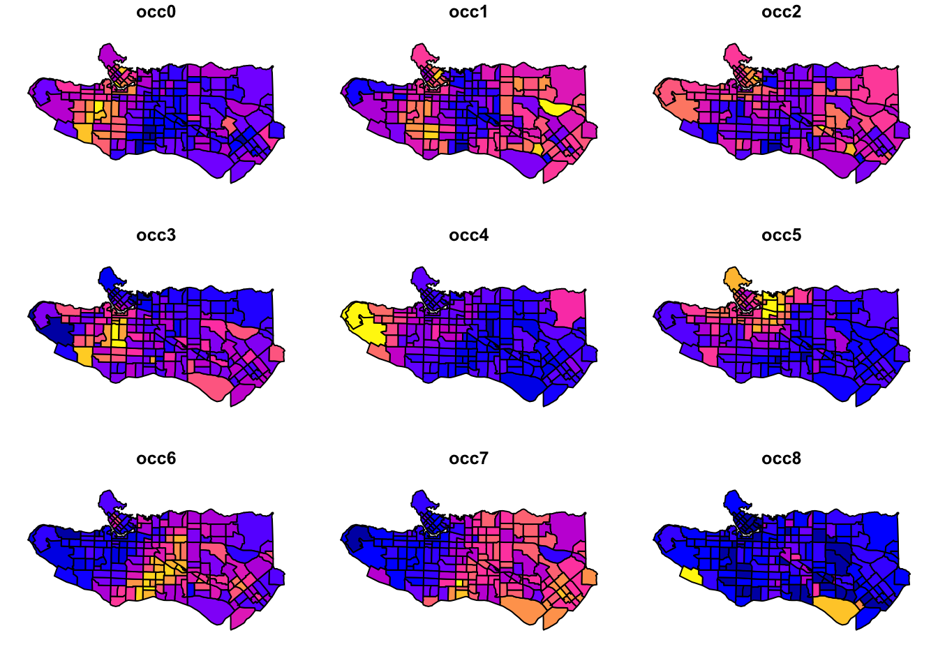
Promising start as there looks to be some fairly distinct regional patterns happening. Next, scale variable values and center them.
ct_scaled <- ct_dat %>%
st_drop_geometry() %>%
mutate(across(.cols = occ0:occ9,
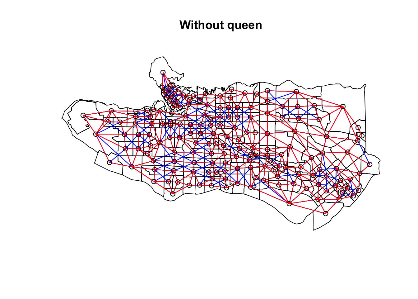
.fns = ~scale(.))) Create adjacency neighbour structure using spdep::poly2nb. poly2nb has the optional argument queen which helps determine the type of adjacency used. By default it is set to TRUE and means that only a single shared boundary point is required to satisfy contiguity. If FALSE then more than one shared point is required. In practice, queen contiguity allows for corner adjacency as in Arizona-Colorado/New Mexico-Utah.
ct_nb <- poly2nb(as_Spatial(ct_dat))
ct_nb_noqueen <- poly2nb(as_Spatial(ct_dat), queen = FALSE)

plot(as_Spatial(ct_dat), main = "With queen")
plot(ct_nb, coords = coordinates(as_Spatial(ct_dat)), col="blue", add = TRUE)
plot(as_Spatial(ct_dat), main = "Without queen")
plot(ct_nb, coords = coordinates(as_Spatial(ct_dat)), col="blue", add = TRUE)
plot(ct_nb_noqueen, coords = coordinates(as_Spatial(ct_dat)), col="red", add = TRUE)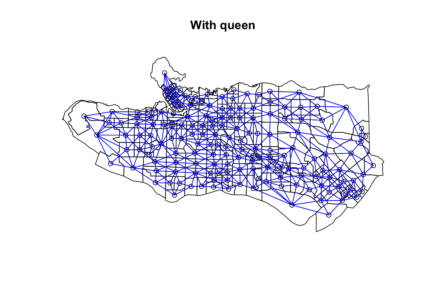
Once the neighbour list is in place, we combine the contiguity graph with our scaled census data to calculate edge costs based on the statistical distance between each node. spdep::nbcosts provides distance methods for euclidian, manhattan, canberra, binary, minkowski, and mahalanobis, and defaults to euclidean if not specified. (Distances between compositional census data should probably be measured using KL or Jensen-Shannon distances, but in the interest of simplicity let’s leave that for another post.) spdep::nb2list2 transforms the edge costs into spatial weights to supplement the neighbour list, and then is fed into spdep::mstree which creates the minimal spanning tree that turns the adjacency graph into a subgraph with n nodes and n-1 edges. Edges with higher dissimilarity are removed sequentially until left with a spanning tree that takes the minimum sum of dissimilarities across all edges of the tree, hence minimum spanning tree. At this point, any further reduction in edges would create disconnected subgraphs which then lead to the resulting spatial clusters.
costs <- nbcosts(ct_nb, data = ct_scaled[,-1])
ct_w <- nb2listw(ct_nb,costs,style="B")

ct_mst <- mstree(ct_w)

plot(ct_mst,coordinates(as_Spatial(ct_dat)),col="blue", cex.lab=0.5)
plot(as_Spatial(ct_dat), add=TRUE)
Once the minimum spanning tree is in place, the SKATER algorithm comes in to partition the MST. The paper details the algorithm in full for those interested, but in short it works by iteratively partitioning the graph by identifying which edge to remove to maximize the quality of resulting clusters as measured by the sum of the intercluster square deviations SSD. Regions that are similar to one another will have lower values. This is implemented via spdep::skater and the ncuts arg indicates the number of partitions to make, resulting in ncuts+1 groups.
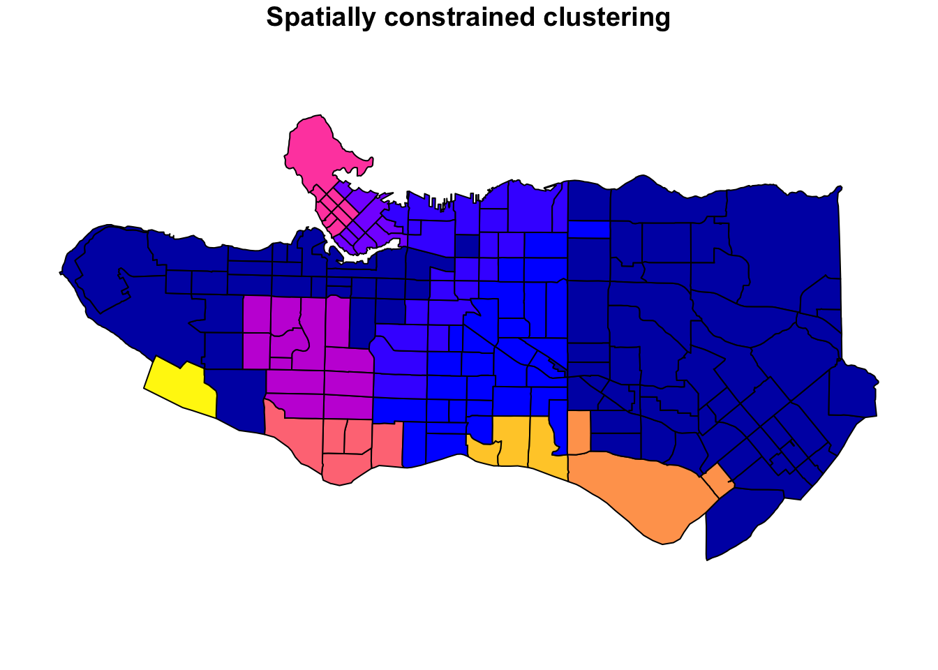
clus10 <- skater(edges = ct_mst[,1:2], data = ct_scaled[,-1], ncuts = 9)What do these resulting clusters look like?
plot((ct_dat %>% mutate(clus = clus10$groups))['clus'], main = "10 cluster example")
All in all, not bad. Those with familiarity with Vancouver and the metro region nearby would not be overly surprised by these groupings. Let’s see what the occupational profiles of some of these clusters look like, taking one as an example:
cluster_profile <- ct_occs %>%
st_drop_geometry() %>%
mutate(clus = clus10$groups) %>%
group_by(clus) %>%
rename(total = v_CA16_5660, `Management` = v_CA16_5663, `Biz, finance, admin` = v_CA16_5666,
`Natural + applied sci` = v_CA16_5669,
`Health` = v_CA16_5672, `Educ, law, govt` = v_CA16_5675,
`Arts, culture, sport` = v_CA16_5678, `Sales and service` = v_CA16_5681,
`Trades and operators` = v_CA16_5684,
`Natrl resources + agric` = v_CA16_5687, `Manufacturing + utils` = v_CA16_5690) %>%
summarise(across(.cols = total:`Manufacturing + utils`, sum)) %>%
mutate(across(.cols = total:`Manufacturing + utils`,
.fns = ~./total)) %>%
mutate(across(.cols = `Management`:`Manufacturing + utils`,
.fns = ~scale(.))) %>%
select(-total) %>%
tidyr::pivot_longer(cols = `Management`:`Manufacturing + utils`, names_to ="occupation", values_to = "share")
library(ggplot2)
library(patchwork)
cluster_plot <- function(cluster) {
(cluster_profile %>%
filter(clus == cluster) %>%
ggplot(.) +
geom_col(aes(x = factor(occupation), y = share), fill = sf.colors()[cluster]) +
coord_flip() + theme_minimal() + ylim(-2.75,2.75) +
labs(y = "Relatively less Relatively more",
x = "") +
theme(panel.grid = element_blank(),
axis.text.x = element_blank(),
axis.line.x = element_line(arrow = grid::arrow(length = unit(0.3, "cm"),
ends = "both")),
plot.margin=grid::unit(c(0,0,0,0), "mm"))
|
ggplot() +
geom_sf(data = ct_dat) +
geom_sf(data = ct_dat %>%
mutate(clus = clus10$groups) %>%
filter(clus == cluster), fill = sf.colors()[cluster]) +
theme_void()
)
}
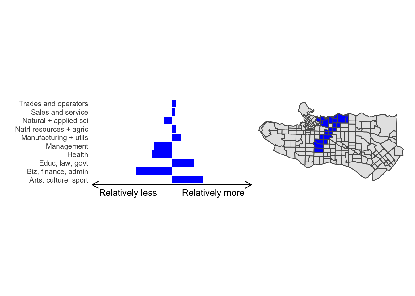
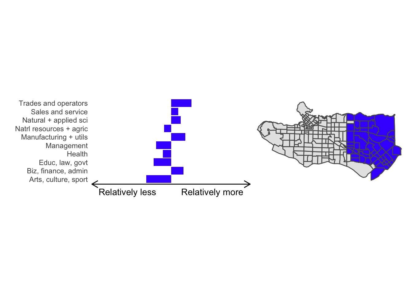
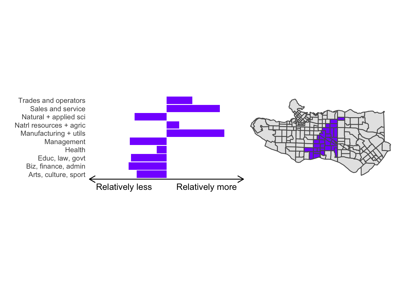
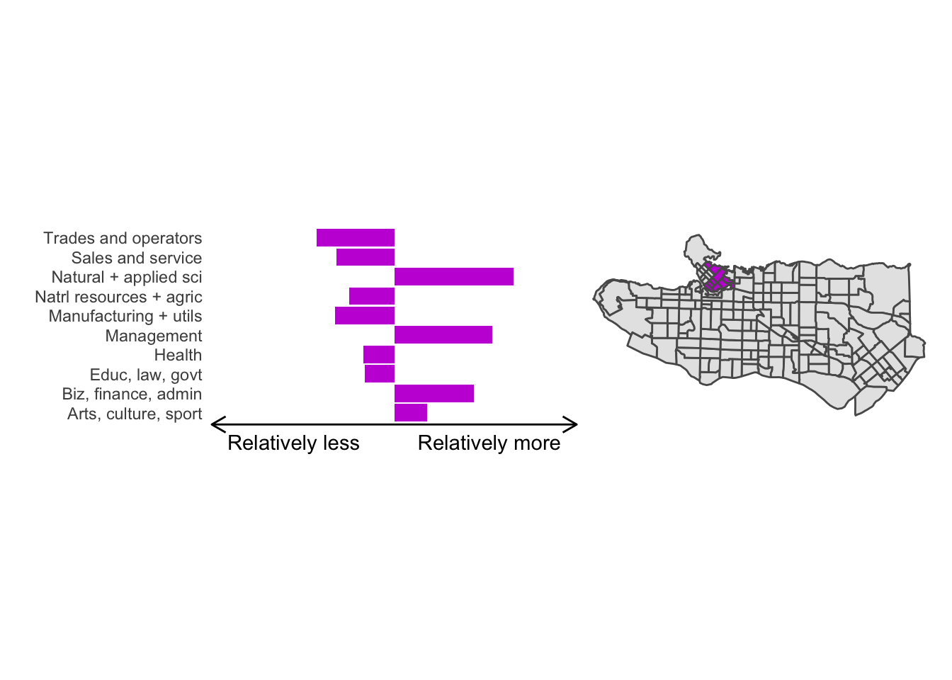
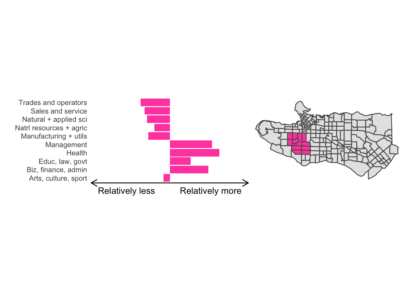
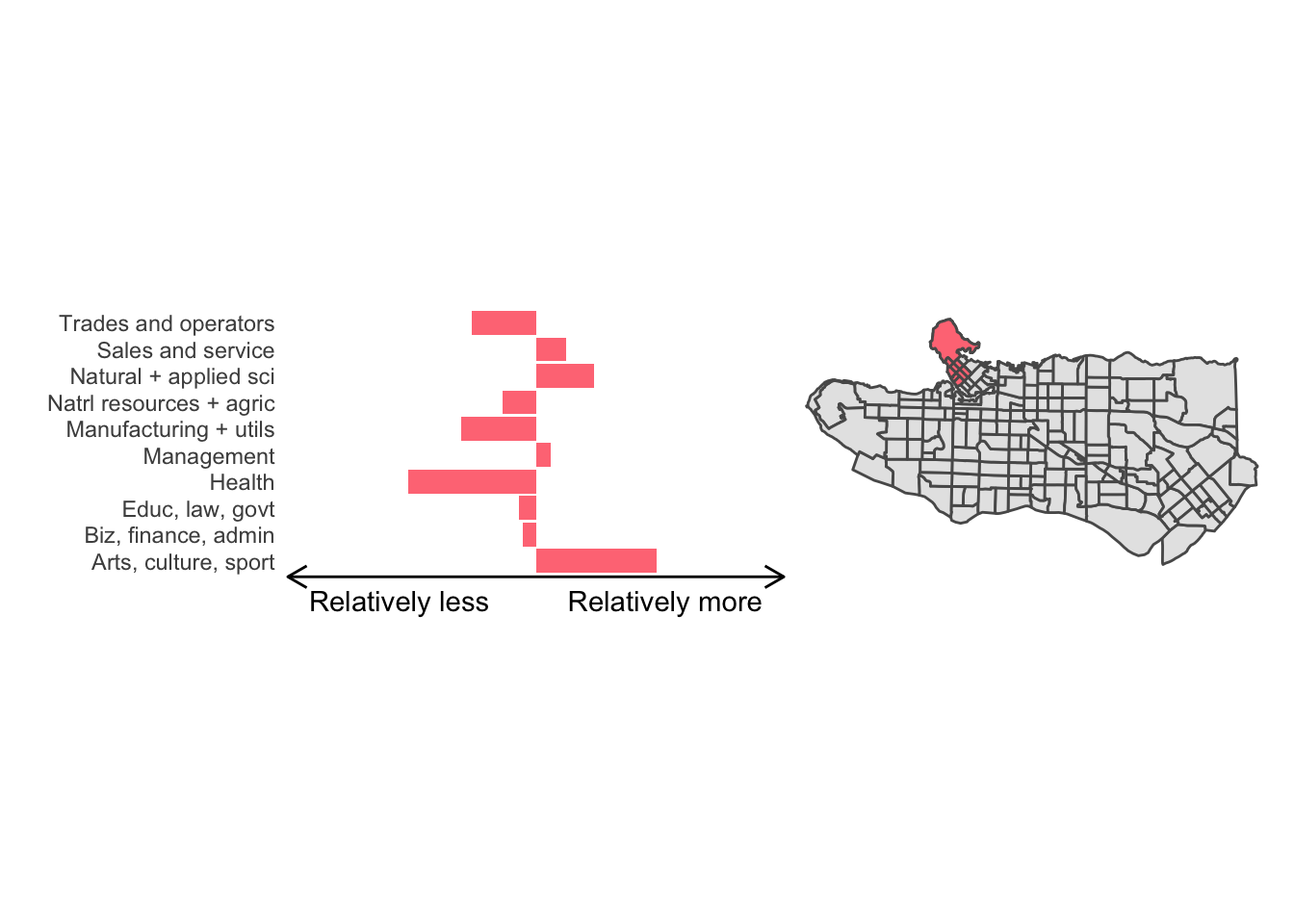
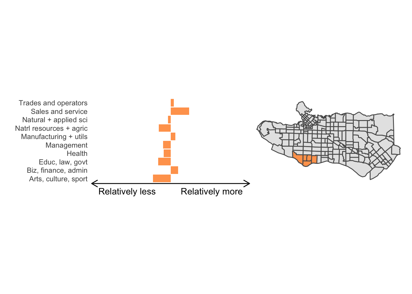
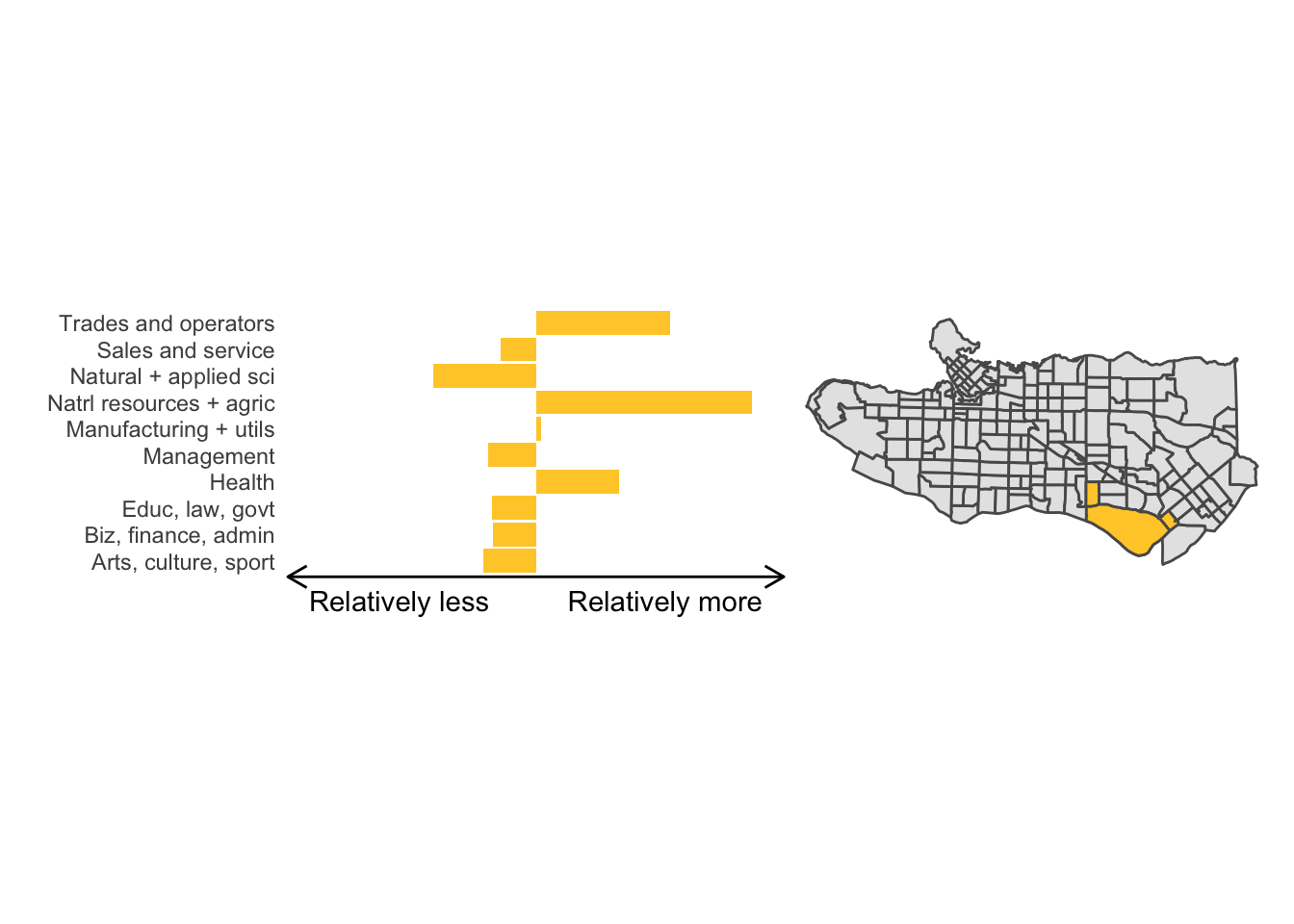
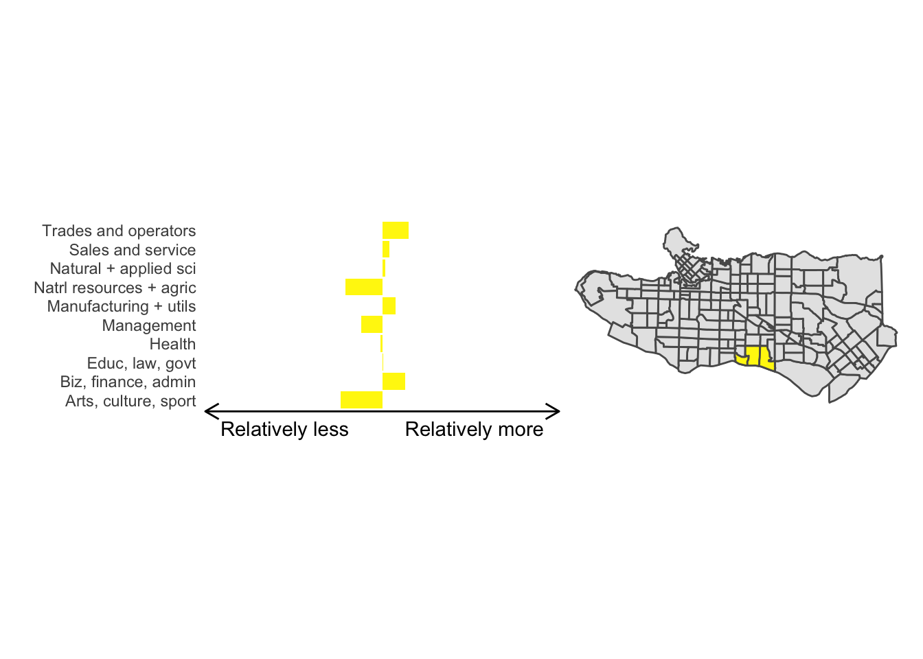
cluster_plot(1)
Overall, these patterns seem to make sense but the dividing line between the city of Vancouver and it’s neighbours is really stark. Shaughnessy, for example, comes out as its own cluster with a relatively higher prevalence of Management, Health, Education + law + govt, and Business and finance occupation groups compared to other parts of these cities, while downtown has an accurate looking split between the West End and the rest of downtown.
There’s a summary of all the clusters formed in this example at the bottom of this post, but keep in mind that the data used and the number of clusters targeted was arbitrary and intentionally simplified for the purpose of this example.
Adding population constraints
The clusters we created above seem to perform well but they have pretty imbalanced populations.
ct_occs %>%
    st_drop_geometry() %>%
    mutate(clus = clus10$groups) %>%
    group_by(clus) %>% summarise(pop = sum(Population)) %>% ggplot(., aes(x = factor(clus), y = pop)) +
  geom_col() + theme_minimal()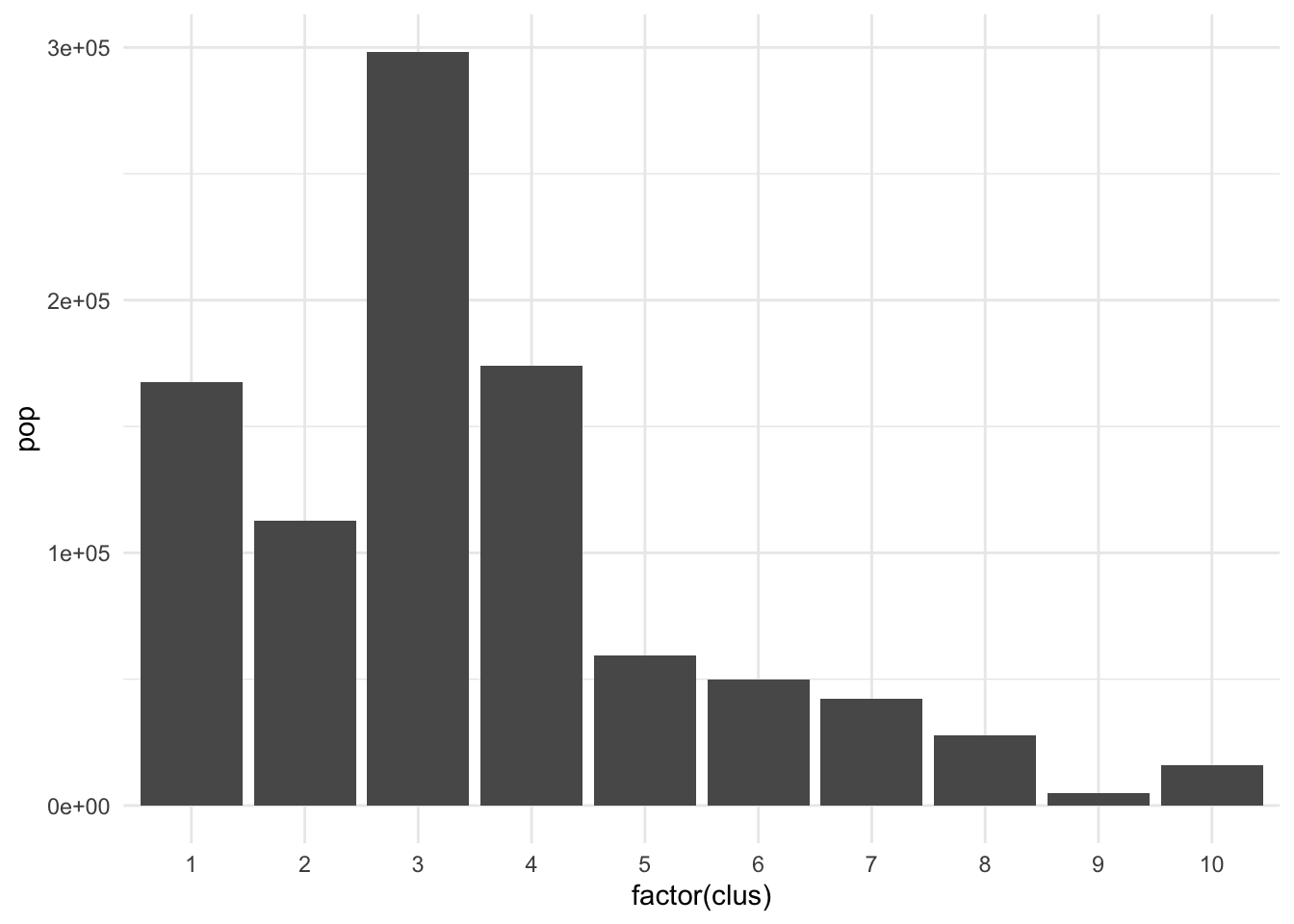
There are many applications where we may want to compromise between cluster homogeneity and having more balanced cluster populations, particularly when designing administrative or intervention regions. The skater function allows for additional constraints to optimize against. The crit argument takes a scalar or two-dimensional vector with criteria for group inclusion which is fed through the vec.crit argument. Replace the population with a constraint vector of your choosing if necessary.
# Requiring a minimum population size of 40000 per cluster
clus10_min <- skater(edges = ct_mst[,1:2],
                     data = ct_scaled[,-1],
                     crit = 40000,
                     vec.crit = ct_occs$Population,
                     ncuts = 9)

plot((ct_dat %>% mutate(clus = clus10$groups))['clus'], main = "No population constraint")
plot((ct_dat %>% mutate(clus = clus10_min$groups))['clus'], main = "Min 40k pop per cluster")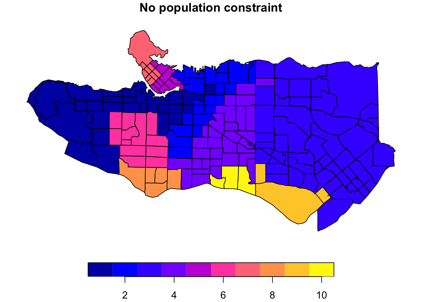

Coordinate snapping for flexibility
Another configuration option is to relax the requirements on spatial contiguity between points. This may be useful in cases where there are physical barriers, like waterways, present in spatial data that do not reflect practical or human barriers. Case in point in our example, we would expect a fair amount of similarity between the region immediately south of the downtown Vancouver peninsula and that directly across from it. These are not considered spatially adjacent in our data and are therefore not eligible to end up in the same cluster; however, we can relax this requirement by taking advantage of the snap argument in spdep::poly2nb when creating the polygon neighbours list.
ct_nb_snap <- poly2nb(as_Spatial(ct_dat %>% st_transform(26910)), snap = 1000)
costs_snap <- nbcosts(ct_nb_snap, data = ct_scaled[,-1])
ct_w_snap <- nb2listw(ct_nb_snap, costs_snap, style="B")
ct_mst_snap <- mstree(ct_w_snap)
clus10_snap <- skater(edges = ct_mst_snap[,1:2], data = ct_scaled[,-1], ncuts = 9)

plot((ct_dat %>% mutate(clus = clus10$groups))['clus'], main = "10 cluster example")
plot((ct_dat %>% mutate(clus = clus10_snap$groups))['clus'], main = "1000m snap tolerance")
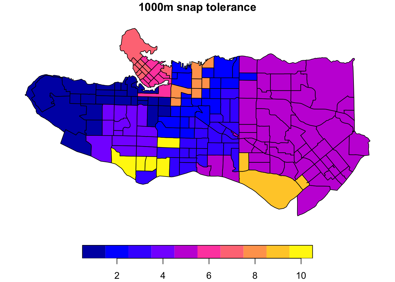 The downside is this introduces some gaps in our constrained regionalization elsewhere. Some trial and error and combination of methods can help. Consider replacing purely geographic input data with a more abstracted version that preserves implicit neighbourhood structure when creating the list of polygon neighbours. Alternatively, the
 spdep package offers alternative neighbour list creation functions including spdep::tri2nb based on Delaunay triangulation; spdep::cell2nb and spdep::grid2nb for working with cell and grid objects; and, spdep::knn2nb to use a nearest-neighbours approach.
Beyond adjacency for neighbour list construction
coords <- st_centroid(st_geometry(ct_dat))
tri_nb <- tri2nb(coords)
plot(st_geometry(ct_dat), border="grey", main = "Neighbours based on triangulation")
plot(tri_nb, coords, add=TRUE)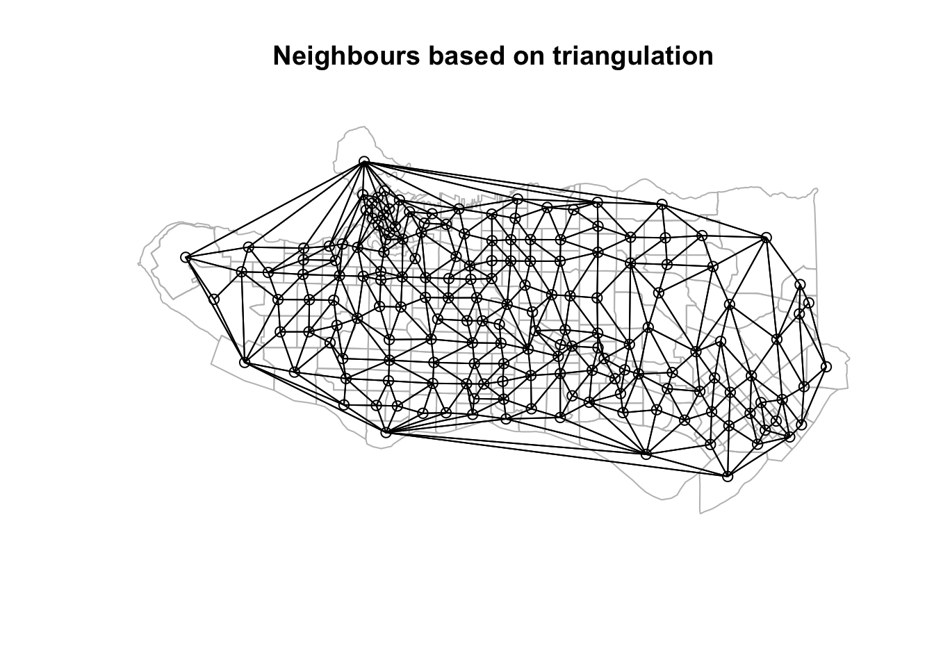
k1 <- knn2nb(knearneigh(coords))
nnb <- dnearneigh(coords, 0, 0.025, longlat = TRUE)

plot(st_geometry(ct_dat), border="grey", main = "Distance based neighbours" )
plot(nnb, coords, add=TRUE)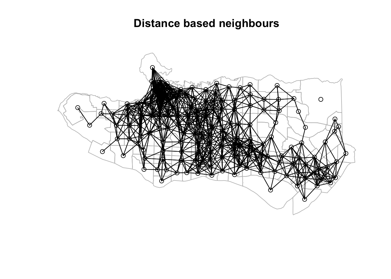
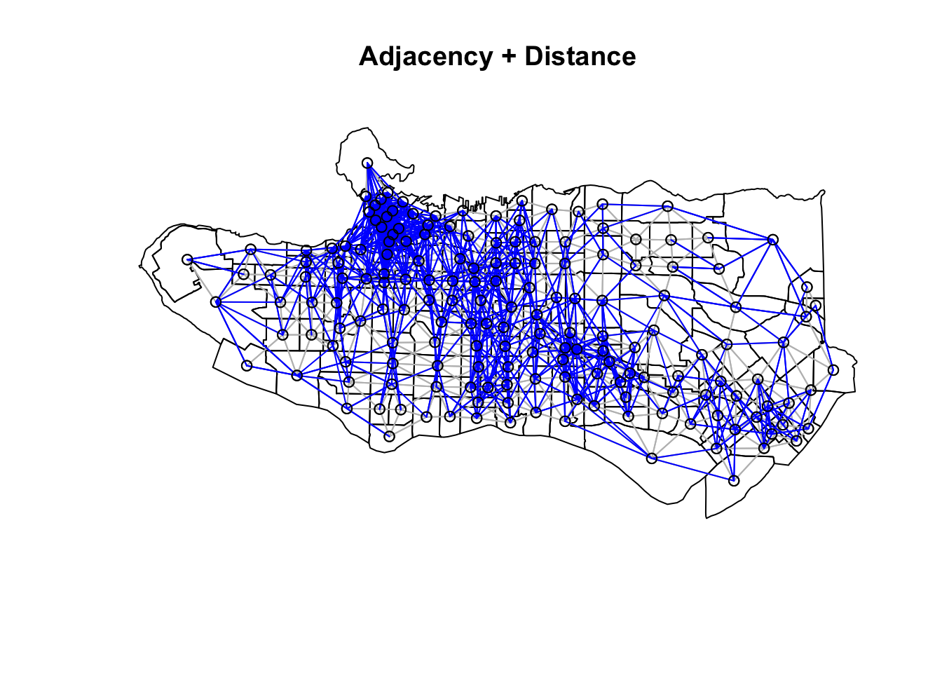
Neighbour list objects can be combined using spdep::union.nb. This can be handy if we want to supplement the adjacency neighbour list with a triangulated or distance-baaed one. For other set operations there is also spdep::intersect.nb and spdep::setdiff.nb.
plot(as_Spatial(ct_dat), main = "Adjacency + Triangulation")
plot(ct_nb, coords = coordinates(as_Spatial(ct_dat)), col="grey", add = TRUE)
plot(setdiff.nb(ct_nb,tri_nb), coords = coordinates(as_Spatial(ct_dat)), col="red", add = TRUE)

plot(as_Spatial(ct_dat), main = "Adjacency + Distance")
plot(ct_nb, coords = coordinates(as_Spatial(ct_dat)), col="grey", add = TRUE)
plot(setdiff.nb(ct_nb,nnb), coords = coordinates(as_Spatial(ct_dat)), col="blue", add = TRUE)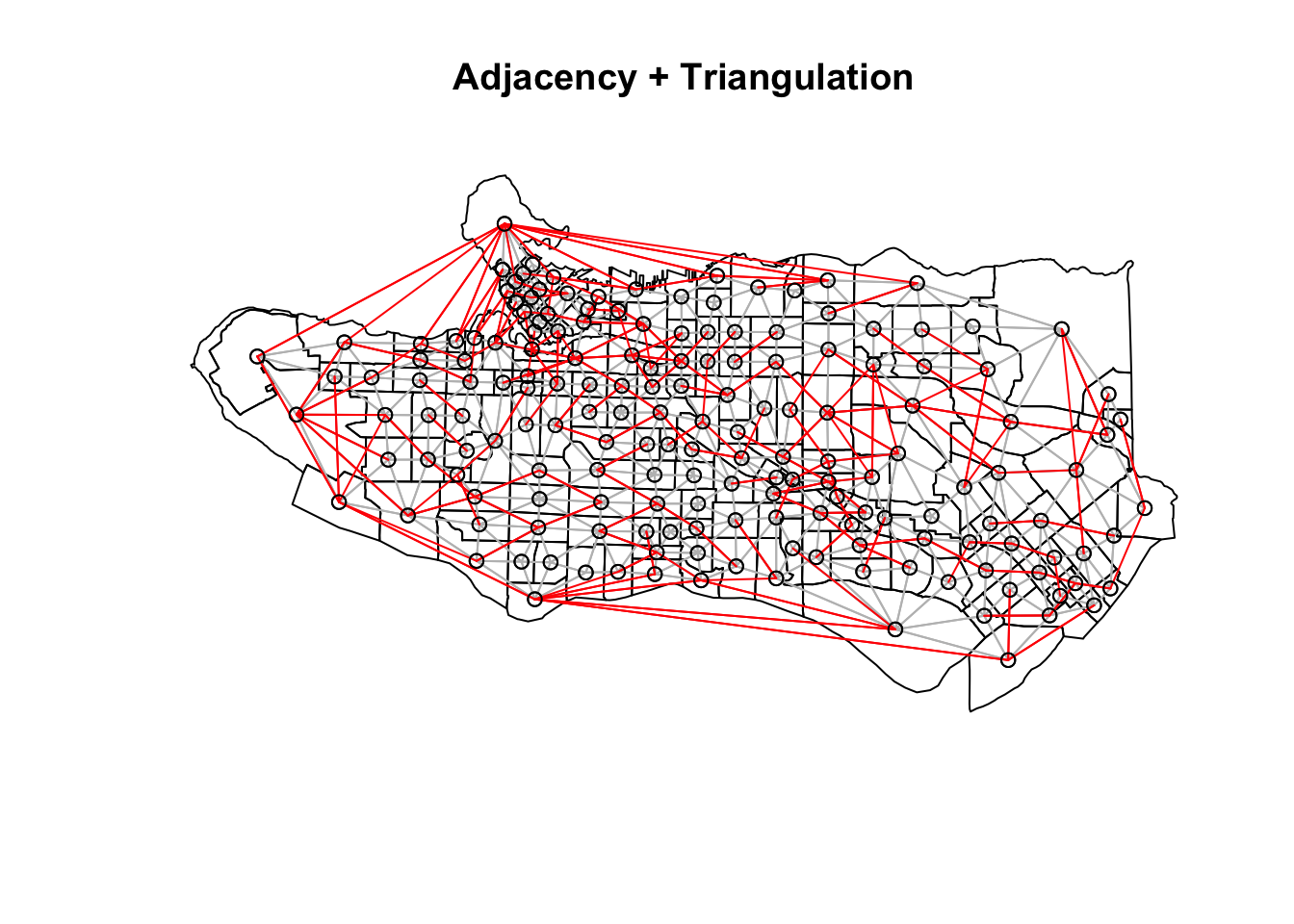
Other approaches
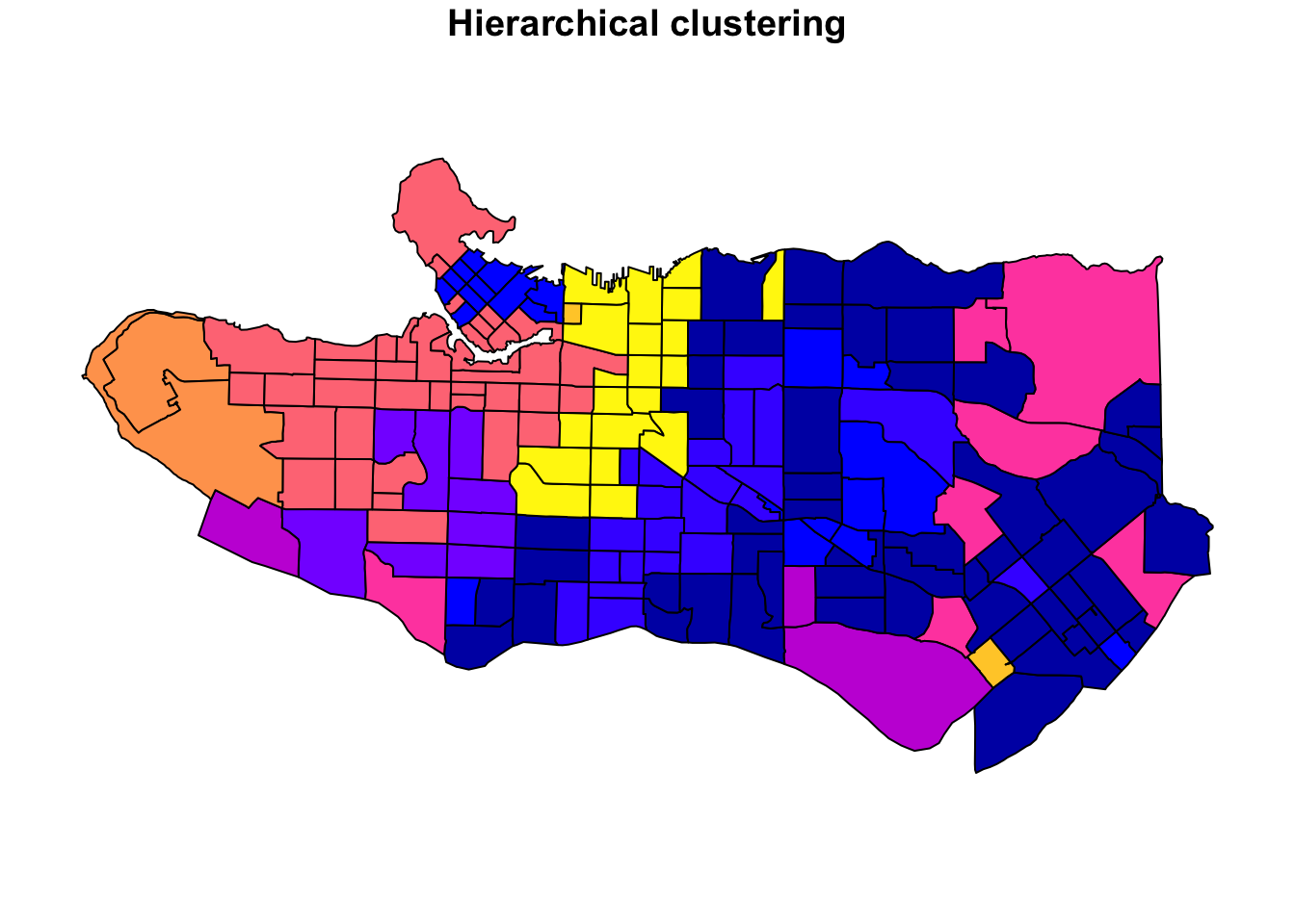
The SKATER approach is not the only way to tackle this problem. There are a number of other methods, however to my best knowledge few (if any) are well-implemented in R. Other approaches include spatially-weighted K-means, which follows a typical K-means clustering approach but also includes the coordinates of observations as part of the clustering process itself. This on its own may not guarantee spatial contiguity, but can be adjusted by placing a greater weight on the coordinates. Another adjustment would be to evaluate resulting K-means clusters (and optimize towards) both cluster similarity and geographic similarity or compactness. Like SKATER, REDCAP (REgionalization with Dynamically Constrained Agglomerative clustering and Partitioning (Guo 2008)) also uses a connectivity tree approach but the optimization process is a bit different. There is an R package spatialcluster with an implementation but it is not on CRAN and I have not tried yet. There is also the Automatic Zoning Procedure (AZP) initially from Openshaw 1977 and updated with additional algorithms in Openshaw and Rao (1995). AZP is an optimization procedure that starts with a set number of regions and moves observations between regions subject to an objective function and a contiguity constraints. This is a highly simplified description of the approach, and a more detailed description (for those wanting to skip the paper) can be found on the GeoDA page. To my knowledge this is not implement in R yet. The Max-P Regions problem (Duque, Anselin, and Rey 2012), unlike the rest, does not require specification of a set number of clusters or regions; rather, the number of regions p is itself part of the optimization problem where the overall task is to identify the maximum number of homogeneous regions satisfying a minimum cluster size constraint, either in terms of the number of observations or using a variable like population. To my knowledge, this approach is not implemented in R but it is implemented in pysal/spopt Spatial Optimization library in Python. This would be a valuable addition to the r-spatial ecosystem.
References
- Efficient Regionalization Techniques for Socio-Economic Geographical Units Using Minimum Spanning Trees (Assunçáo et al, 2006)
- Luc Anselin’s tutorial on spatially constrained clustering methods
- Creating neighbours vignette from the
spdeppackage by Roger Bivand - How Spatially Constrained Multivariate Clustering Works on ESRI’s ArcGIS site
Full cluster details
## [[1]]##
## [[2]]##
## [[3]]##
## [[4]]##
## [[5]]##
## [[6]]##
## [[7]]##
## [[8]]##
## [[9]]##
## [[10]]